April 22, 2012

This week: 3mm lead holder battle

So finally, a comparison between two of the cheapest currently available 3mm lead holders. There's the Graffiti, given to me by Comic Tools reader Alberto, and the Koh-i-noor, which I bought on Amazon.

First, a word on why I'm using these, when I already have a perfectly good 2mm lead holder, and more leads for it than I could use in several years. As I'm developing a style of drawing for this book I'm working on, I'm being led towards a method involving colored leads. I want erasable leads, and not a lot of colored leads are erasable. If you like thin leads like those in a mechanical pencil, several readers suggested the Pilot Color Eno leads. Reader Greg H had this to say about them:
I can back-up that recommendation for the Pilot Color Eno soft blue. I got hooked on the col-erase pencils while working in animation, but started to look for something that wasn't so hard and waxy. The Pilot leads have a softness that makes them pleasurable to sketch with and they erase beautifully. Aside from Jetpens, you may find a supplier on ebay.

Stay away from the Uni color leads if you're the least bit ham-fisted like me. They snap repeatedly. 
Pilot is a great company and with so many similarly enthusiastic recommendations I'd say that if erasable colored leads for your mechanical pencil is what you want, those are what you should buy. They come in different colors, btw.

But I'm starting to really shy away from thin pencil tips, which is why I like my lead holder. I can go pointy or blunt like with a pencil, but I don't waste all the lead that you do with a pencil. (Yes I know they make special cigarette holder type dealies for when pencils get short, but why pay for the wood and extra assembly?)

Here's where we get to this post from two weeks ago, wherein I dissected out the lead of a Prismacolor ColErase pencil to put into my lead holder and found that it didn't fit.

So, if you are an insane person like me, and you have a wood pencil lead (which is usually 3mm), and you don't want to just use the damned pencil, and instead you want to use it's lead in a lead holder, these are your two cheapest options.

1: Graffiti
 I thought the shortness of this thing would bug me. I figured either it would be awkward to hold, like knives with small handles can be, or that it's balance would be all messed up. I also worried that the thickness would make it feel clunky and imprecise to draw with, the way those things you put on pencils to help ease carpal strain can. In fact, this tool is quite the fleet and natural in hand. The fatness is actually up in your hand, not at your fingertips, and your precision feels just the same as if you were using a fine pencil. Yet because of the fatness farther back, your grip is eased and comfortable. The taper  towards the back hits right about where the webbing of your thumb is, so there isn't thick wood hindering you when you swing the pencil about into different grips. And the length is such that my tiny hands can actuate the lead feed ball without moving my hand up the shaft. 

What affects it's performance the most, and is what in my opinion would divide people over these holders, is the weight. It's VERY light, and what that means for me is my hand will get ahead of itself, especially when using harder leads, and lead me to be less precise with my marks. I've found I love it for thumbnailing, but it's a bit of a nuisance for more detailed drawing. 

One last thing, it lacks an integral sharpener. I don't care because I prefer a knife sharpened pencil point, but if you're not so good with a blade it could be trouble, as it won't fit into a lead pointer. 


2: Koh-i-noor
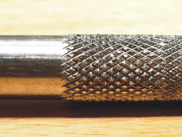
 I loved this the second I touched it. I was worried about the lack of knurling near the tip, but it turned out that just like with pocket knives, a textured handle often hides the sin of poor ergonomics. This pencil is weighty, metal, and confidence inspiring. It's not so heavy that it's hard to draw with, which I was also worried about after having had a past lead holder that was. But the weight does affect the drawing- the weight of the pencil will make a mark, and when you draw circles and straight lines it steadies your hand with a reassuring pressure that make precision drawing seem easier and less scary. I found myself not needing to hold my breath as much when drawing straight lines or precise curves. On the other hand, if you try to sketch all crazy fast it's intertia will inhibit you, slightly. I've found that I like this holder for finish pencils.

It has an integral sharpener in the lead feed button, and it works well. The pocket clip is VERY robust. You aren't going to lose it.

If you want one, you can buy it here.


Remember the entry I did awhile back where I linked to some articles about how piss-poor movie Hawkeye's archery form was? Well David Aja seems to be doing the opposite of that.  Almost comically so. Google basically any drawing of Hawkeye and these look cooler than whatever bullshit he's doing in those, I'll tell you that.

Remember that entry I did awhile back about Oblique nib holders? Here's Dennis Pachenko using one:

I'm using a Hunt Imperial 101 nib with an oblique nib holder. For the bigger letters I'm using C5 and a C6 lettering nibs. The Hunt 101 is very flexible for some line weight variation, but thicker than the Hunt 102.
I'm really intrigued by the simple and effective way Joseph Lambert conveys Hellen Keller's mental picture of herself and her surroundings in his comic biography of her teacher, Annie Sullivan. It's one of those effects only possible in our wonderful medium.

April 14, 2012

This week: World, meet Elizabeth.


I got the lead holder I ordered, but it shipped from the Czech Republic and arrived a lot later than I thought, so I have not had time to properly test it. So instead I thought I'd share with you a milestone I had this week.

As either a nerd who reads everything too thoroughly and retains everything, or as a stalker compiling facts about my life, you may be aware from past entries that I basically didn't draw anything for almost a year and a half, and that I am nonetheless working on a book written by a friend of mine. I've mostly been doodling and doing character design while my drawing hand slowly regains it's lost abilities and my mind remembers dozens of lost tricks. I've mostly been working on one character, the female lead character, Elizabeth. Some of you have probably had the experience,when designing characters for a story, that there's always at least one character whose likeness escapes you. You can't quite capture their glance, or the line of their jaw. You draw face after face and the expressions on them aren't the expressions your character would make. (By the way, something that goes a long way to solving that, and this is one of those tricks I forgot with disuse, is whenever you draw a character's face, think the thought they're thinking at that moment. Same for the whole pose, actually. Think the thought they're thinking, and your picture will look like a character existing and doing, and not like a posed wax figure.) I had actually captured her general appearance my first time out, in this quick sketch:

But in this sketch she looks menacing, troubled. And she actually smiles a fair amount in the book. But she's not a character to whom smiling comes easily; it wouldn't be her expression at rest. The other tricky thing about her is, her face is designed around animal features, a reflection of her true nature. And although she'll never look as animal as she does in these sketches,

I do want to be able to subtly make her more or less animal in some scenes. All the non human characters will share this general design attribute.

So my quest was, take that first drawing and find out what she'd look like smiling. That proved to be difficult. In the end I'd do 202 drawings, all unsuccessful. Many, like these, looked good as drawings, but simply weren't her:

The problem with character design is, you're trying to capture the likeness of someone you've never seen until you draw them. I finally started making small drawings that almost looked like her, like these,
So I decided to go bigger. That led to this drawing. And there Elizabeth was, finally smiling at me: (at Daniel, actually.)

Now, by no means is this a good drawing as a drawing. It's lopsided, fails the mirror test, and is far, far too overwrought. But none of that matters because this isn't a finished drawing, it's a sketch, and it's the sketch in which Elizabeth finally revealed herself. I can now imagine her making any expression at all, striking any pose at all, in the way Elizabeth would and no one else.

The title image is just this drawing photoshopped a bit to show more of what I see when I look at this drawing: I always see my inks when I look at my penciled drawings, even rendered ones.


Kate Beaton's Katniss
is the best Katniss.

I love it when Craig Thompson posts about pages that would have been perfectly good and shows how he pushed them to make them amazing.

I get such a kick out of this drawing by Sam Hiti:

April 7, 2012

Col-Erase leads

There aren't any.

Let me back up.

So, many of you don't pencil with graphite pencil that requires erasing afterwards. Many of you use blue pencil, or red, or whatever. Because we have scanners now you can use just about any color you want to. Well anyway, one gripe many have with colored pencils and colored mechanical pencil leads is that if you DO want to erase them, they don't erase well, if at all. The reason is the wax binder they use. You can buy the fabulous Prismacolor Col-Erase pencils, but if you're like me and you both loath pencils and prefer lead holders, you're SOL because they don't sell just the leads, they only sell pencils.

Well you know me, that just wasn't going to do at all. So my first thought was, I'll just split the pencil open, carefully remove the lead, and put it into my lead holder. Well, getting it split open worked great...

...and then I found out the lead inside is 3mm wide and my lead holder is 2mm. Wouldn't fit. And there aren't a lot of 3mm lead holders on the market. So, I put out the call to see if anyone had one to spare. No one wrote back for a bit with what I needed, so I bought this one on Amazon, which is still on it's way. But in the meantime, Comic Tools reader Alberto dug up one of his Grafitti 3mm lead holders, and graciously sent it along to me, along with a ton of other goodies. Look at this load!

Included in the package was, appropriately, a non-photo blue pencil,


a whole bunch of leads in various unusual packages, including this flippy door one,this wooden one,

and this very unusual pack of short leads in what I can only describe as a cardboard blister packet:

He also sent the replacement guts for two sizes of Staedtler Marker.
So here is the extracted lead, and the pencil to fit it:

And here they are together. Exactly what I wanted!

So what I'm gonna do next week is review the two lead holders against one another, since they're actually still both for sale, and see which comes out on top.

In the meantime, my great thanks to Alberto, you are too generous!

Oh, and it looks like someone tipped Jesse off about my attempt at fundraising for his podcasts. Thanks, whoever! See you next week!

March 31, 2012

This week: Bullseye!

Podcasts are a staple for many cartoonists, whether as a free source of quality media for people who can't pay for cable, or as something to listen to while working. They've also become culturally important. I'd wager that if I made reference to an episode of Savage Love, This American Life, or Radiolab it wouldn't go over too many of your heads. For those of you who do listen to these podcasts, they're likely more than just entertainment for you. You've probably gleaned some real philosophy and life lessons from their content, or heard things that inspired you creatively. Well, for years now the family of podcasts created by Jesse Thorn for MaximumFun.org have been one of the most important cultural parts of my life, perhaps none moreso than Jesse's podcast formerly known as The Sound of Young America, now known as Bullseye.

Since he was 19 at UC Santa Cruz, Jesse has been doing some of THE best interviews I have ever heard in my life. First of all, he interviews people I find interesting- artists, musicians, authors, comics, directors, and yes, cartoonists from time to time. But most important is the kinds of questions he asks and the answers those questions get. Jesse was the first person I have ever heard, in my life, give a non-retarded interview with a rapper. You wouldn't think it to look at him, but Jesse is a walking encyclopedia of rap and hip hop, both musically and historically. So whereas most interviewers would ask something ignorant and wearying like "So your lyrics are really violent. Why is that?" and get a dumb, tired answer like "Yo we jus keepin it real, nowwadimean?", Jesse will be like "When listening to the fifth track of your debut album I couldn't help but be reminded of a Philedelphia based funk group I like, and as it turns out I read that you actually lived in Philly with your aunt for two years when they were playing, and I was wondering if there was any connection there?", to which the rapper would then reply with an extremely interesting story about their family life at the time, what the underground Philly funk scene meant to them as a young man, and what about it influenced them musically.

Jesse asks extremely perceptive, well researched questions about the art people make and how their lives, and the art around them, shaped their art. He likes especially to talk about how and why creators mature, both artistically and as people. Everyone he interviews acts like they've waited their whole lives to be asked questions like this. God knows I'd waited my whole life for someone to ASK questions like this.

All ten years of the show are available, online, for free. The archives are searchable. All the new shows are free, you only need subscribe. Ten years of interviews with the best creators of our time, probably the best interviews they ever gave, free.

And that isn't even to mention all the great comedy podcasts Jesse and his team put out, including Jordan, Jesse, Go!, Judge John Hodgman, and more. Every week I get about 3 hours of new, high quality media, free. And did I mention that it's all made in Jesse's living room? And that it's all paid for by donors?

I am one of those donors, and since this week Jesse is in the second week of his annual pledge drive, I'd like to make you all into donors too.

Here are the episodes he's done with cartoonists, that I can remember:

Kate Beaton
Charles Burns
Roz Chast
Steve Wolfhard
Gahan Wilson
Ariel Schrag
Tony Millionaire
Dan Clowes

Give them a listen. And if this show seems worth it to you, if you like it enough to subscribe to it, then please do the right thing and become a donor. You can give as little as two bucks a month, though there are gifts with higher pledge levels. The money goes straight to making shows. They're not NPR produced so there isn't even THAT middleman. I will send a hand written thank you note to any Comic Tools readers who become donors, and I will do a sketch on it if you become a donor over the ten dollar a month level. But really, after listening to these, you'll want to thank me. And Jesse, of course.

March 28, 2012

Does anyone have a Caran D'ache Fixpencil 3mm lead holder and/or Grafitti Pin Head 3mm lead holder they'd be willing to sell/donate?

March 25, 2012

This week: The perfect pen?


Sarah Glidden says this may be the perfect pen. From her review:
"Well, the search is over. I found the perfect pen. Let me rhapsodize about the Carbon Desk Fountain Pen. I will need no other pen now. Its waterproof, has a fine line, the ink flows perfectly, and it only explodes and gets ink all over my fingers every once in a while."
Additionally, from her facebook post about it:
"...and I did not mention that I found this pen by describing my perfect pen to the guy who works in the pen and ink section of Senellier, the greatest art store in the world, and that, with a twinkle in his eye, he held up the pen and said 'this is what you are looking for.' I took the pen and tried it out on a scrap of paper, mesmerized by the lyricisim of its line. 'Yes, this is exactly what I was looking for!' I exclaimed. I turned around, smiling, to thank him, but there was no one there. 'Maybe it was all a dream," said the pen.'"
I haven't bought and tested the pen yet, but Sarah draws on the go all the time, hopping country to country and drawing prolifically. She's field tested the thing better than I ever would for a review. Waterproof fountain pens aren't just hard to come by, they essentially don't exist. The Japanese were the first to develop pigmented ink ground to finely it wouldn't clog a brush pen, which is why all good brush pens with waterproof fade proof ink are from Japan, and I presume that technology has something to do with the ink in this pen. You canNOT just go shoving regular drawing ink into a fountain pen. Years ago I used a cheap ass, old broken plastic fountain pen for lettering, that I modified to (sort of) allow it to use brush pen cartridges with minimal clogging. It was one of my favorite tools. It did eventually clog, though, and that was that. I wonder if this tool would fit that role? I currently use pointed sticks for lettering, as some of you may recall.


This is a great interview with long time super friend of Comic Tools Brian Lee O'Malley. He's asked how be broke into the business, and he lays out the events of his career from it's very beginning to show that he did not "break into" the biz, but just like everyone else, he built up a body of work over a period of lean, agonizing years, until finally a combination of whim and luck blew a part of the enormous ember he'd created into flame.
"In late 2008 and into 2009 I actually made money off of comics - see, each book comes out and people talk about it and some people heard about it for the first time so they go buy the first book, then if they like it they have to buy the other books. Doing a series adds up over time, if you can keep it up and stay semi-popular. ... There is no advice here, there’s no “breaking in” tips, that’s just how it happened for me. A little bit of talent, a lot of perseverance and hard work, a lot of luck."

In reference to last week's post, boy did this artist ever get the bow form right! And look how badass it looks!


By the way, if you're the sort of person who wastes your employer's time by surfing the web at work and you're mad that I posted an image above that might not be appropriate for the environment where you shouldn't be web surfing in the first place, you should take a look at this post by Warren Ellis, which perfectly captures how I feel about the matter.
Hi new people!

For any regulars who didn't see my facebook post or tweet about it, Heidi at The Beat wrote a post about last week's entry, specifically in regard to the articles by Jim MacQuerrie I posted last week regarding three current cinematic archers. (By the way, it turns out Jim is also a cartoonist. Here's his site.) I'd like to welcome the new readers and fill you in on what this blog is.

Comic Tools blog is a resource, first and foremost. The blog was started by writer/cartoonist MK Reed (who just put up a new chapter of her comic About a Bull, based on Celtic legend, go see.) Comic Tools blog began as an interview blog. MK is a very social person, very amiable, and much more developed in her writing than her art, though I rather like her drawings myself. She decided that the way she'd find out about drawing tools and techniques was to ask people whose work he liked, and she figured as long as she was educating herself she'd educate the world while she was at it, so she made a blog of it. Here's an old post by MK, surveying Hope Larson, a longtime good friend of this blog.

Eventually for various reasons MK couldn't work on the blog anymore. By this time I was an ardent Comic Tools fan. Mk had started branching out from the rigid survey interview into posts about tools. I LOVE process and craft stuff, it's sort of my thing. MK had even linked to a few posts from my personal blog. When MK decided her time at Comic Tools was at an end she asked if I wanted to keep it going. I said yes absolutely.

For awhile I hewed pretty close to the format MK had established, interviews and tool info interspersed with illustrative pictures and links to interesting articles or websites.As I became more comfortable as this blog being my thing I started doing tutorials. I love tutorials. I can't decide whether I like reading or making them more, but goddamn do I love the passing on of hand skills with illustrated text. Some were strictly about physical tools, like how to use ruling pens, or brush care, or how to keep your white out from ever drying out. I built the camera mask, which allows me to take POV photos of both of my hands at the same time, so when readers go to replicate a technique it looks to them just like it did in the pictures.

Other posts used a more expanded definition of tools, to include not just physical tools, but mental tools. Little bits of craft that can be implemented immediately with little or no practice, which will instantly improve someone's art, regardless of their style or level of ability. This post on Balloon shape is one of my favorites.

I was working on a major book project at the time that required me to really beef up my ability to render somewhat naturalistic figures, and I found that when I went looking for good anatomy resources for comic drawing, there basically were none. Human anatomy texts basically tell you "Here is a box. Here is a picture of every muscle, vein, and ligament in the body. And here is a useless visual metaphor for how some parts move by George Bridgman. Now just draw the box and then fill in perfect anatomy." The very best human anatomy resources for artists, the guides by Andrew Loomis, still basically say "Here's some basic shapes, now just lay perfect anatomy over them." That's when I did the anatomy posts, which I'm most proud of of anything I've done here. I am the first person, to my knowledge, to create a system for drafting or checking anatomy for comic drawing. My basic shapes can be used with no further additions to position and correctly proportion any humanoid character, no matter how cartoonish. If you take them a step further, merely by adding a few dots and connecting some lines, you have a good enough skeleton to check really basic non-realistic anatomy on, especially helpful with weird poses or characters you can't quite draw on model yet. Finally, because all of the basic shapes are based on real skeletal features and not boxes approximating body masses, you can hang muscles off them, with as much or as little realism as you like, very easily.

Those posts, and the tool posts, started to bring in a pretty big readership, enough that I had a brain pool to draw from. I could ask my readers, which include many professionals, for help with topics they knew that I didn't, and in comments readers will chime in with incredibly useful information, which I'll then post. Readers have done whole posts for the blog, in fact, even photo tutorials.

I'm the current author of Comic Tools blog, but what this really is is a centralized, free, one stop resource for information about making comics, most especially the sort of information I don't see available anywhere else. I hate how difficult it can be to find basic craft information about comics, even in colleges. Again and again it's like artists have to learn from scratch. How would it be if science were that way, for goodness sake? The goal of this blog is, and will continue to be, a one stop resource for knowledge about the craft of making comics, drawing from an enormous brain trust of artists we've interviewed, readers who are most of them working professionals, and every post, article, and book I can lay my hands on. When someone is just starting with brushes and has no idea how to use them, or wonders what a lettering nib is, or wonders what Jim Woodring uses to make his distinctive lines, they should know Comic Tools Blog is here with the answers, and if we don't already have it, we'll find out and post it.
Last night instead of posting I stayed up till 5:20 finishing The Hunger Games in one sitting. I'll post later today when my forehead doesn't feel like a compressed fogbank. Apologies for the delay.

March 16, 2012

This week: Getting the details right

Last week I was reading the new issue of BPRD, and I had an epiphany when I got to this terrifying panel by new series artist James Harren:

The epiphany concerned something about the design of the were-jaguar god designed by Guy Davis that I've been pondering for some time. This is Guy Davis' original design for the were-jaguar god:
For years now I've been pondering it's hands, and asking myself what made them seem so catlike even though structurally they're human hands. Having to really study paws for last week's entry sowed the seed of the answer in my head, and I knew it as soon as I saw Harren's drawing: its holding invisible paw pads in it's hands.

I mean, I'm sure that's not how Davis or Harren think of it when they draw the creature. Davis probably just intuited the structure of how a cat's paw looks and drew a human hand twisted into that position. But I've tried drawing it myself, and I could never seem to quite get it right. Looked at through the lens of what I learned doing that post however, it's now so clear: the resting position of the creature's hands matches the way an animal's fingers wrap around it's paw pads. Even without the pads there, it looks paw-like. It also looks twisted an horrible- if you try it, you'll see you can't really do that with your fingers, at least not that far back.

That's not all Guy did either. Remember the vertebral ridge that four legged animals have between their shoulder blades? The creature totally has that, and the line of it's neck goes from that ridge to the top of the back of it's skull, just like on a four legged animal. Because it's standing, it gives the were-jaguar a hunched, looming posture. And it's ribcage isn't wide like a human's, it's deep and narrow. These characteristics are what allow the creature to look natural both moving like a humanoid and moving like a cat, while looking like neither.

The trick with the hands isn't unique to the were-jaguar. Davis also used it for his design of the Wendigo. Again, look at how it's hands behave like a paw without the pads, allowing it to have both human and animal movements:


Anatomical details also matter when you're depicting a character who's supposedly an expert at some sort of physical skill, like gymnastics or punching or, as in the following examples, archery.

Archery coach Jim MacOuerrie recently wrote articles about 3 arches appearing in upcoming films: Katniss from The Hunger Games, Merida from Brave, and Hawkeye from The Avengers. Before you go read the articles, before I even say anything, I want you to look at the following two images and register your instant mental impression of which of them looks cooler, and also which looks like the better archer. Do it now.


Even those of you who know dick about archery are saying Merida, right? Of course you are. Just because you don't know what good archery form is doesn't mean you still can't see things like tension, lines of force, and form. It's the same reason you might not know what good dancing is, but you know it when you see it. In fact, if you read the articles, the guy playing Hawkeye is making almost every conceivable rookie mistake there is. His form is so bad that he literally could not possibly hit his targets at all. In contrast, Merida and Katniss both have perfect, olympian form. For those of you who don't know, Hawkeye is supposed to be the best archer in the whole universe of some shit like that. And here he is looking less experienced than two ladies, even to the untrained eye. To the trained eye he looks goddamned ridiculous. The author even shows an 11 year old girl looking more cool and athletic than Hawkeye.

That Katniss and Merida have correct form is no accident: The actress playing Katniss studies with an olympic archer, and the Pixar folks did their motherfucking research. With the internet, this is not hard for artists to do. It pays off not just because you'll have the private satisfaction of getting the details right: with physical action, getting the form right makes things look cooler, more badass, more beautiful.


You guys all know how much I love process art, and in searching for images of James harren's work online to find that drawing he did of the Jaguar god, I found some step by step pages on his Deviant Art page. As it turns out, doing BPRD has really forced him to learn as he goes and reassess his drawing process, which he talks about in these two examples:

Here's an older page,

and here's a newer page.

Look at those panels of Abe fighting that monster. Talk about lines of force!

Finally, I have happy news. The marriage equality comic I posted about last week did even better than it's Kickstarter goal, will will definitely be happening! I don't know if any of you donated, but if you did, you have my thanks.

Seeya next week!

March 11, 2012