Showing posts with label tool reccomendations. Show all posts

April 22, 2012

This week: 3mm lead holder battle

So finally, a comparison between two of the cheapest currently available 3mm lead holders. There's the Graffiti, given to me by Comic Tools reader Alberto, and the Koh-i-noor, which I bought on Amazon.

First, a word on why I'm using these, when I already have a perfectly good 2mm lead holder, and more leads for it than I could use in several years. As I'm developing a style of drawing for this book I'm working on, I'm being led towards a method involving colored leads. I want erasable leads, and not a lot of colored leads are erasable. If you like thin leads like those in a mechanical pencil, several readers suggested the Pilot Color Eno leads. Reader Greg H had this to say about them:
I can back-up that recommendation for the Pilot Color Eno soft blue. I got hooked on the col-erase pencils while working in animation, but started to look for something that wasn't so hard and waxy. The Pilot leads have a softness that makes them pleasurable to sketch with and they erase beautifully. Aside from Jetpens, you may find a supplier on ebay.

Stay away from the Uni color leads if you're the least bit ham-fisted like me. They snap repeatedly. 
Pilot is a great company and with so many similarly enthusiastic recommendations I'd say that if erasable colored leads for your mechanical pencil is what you want, those are what you should buy. They come in different colors, btw.

But I'm starting to really shy away from thin pencil tips, which is why I like my lead holder. I can go pointy or blunt like with a pencil, but I don't waste all the lead that you do with a pencil. (Yes I know they make special cigarette holder type dealies for when pencils get short, but why pay for the wood and extra assembly?)

Here's where we get to this post from two weeks ago, wherein I dissected out the lead of a Prismacolor ColErase pencil to put into my lead holder and found that it didn't fit.

So, if you are an insane person like me, and you have a wood pencil lead (which is usually 3mm), and you don't want to just use the damned pencil, and instead you want to use it's lead in a lead holder, these are your two cheapest options.

1: Graffiti
 I thought the shortness of this thing would bug me. I figured either it would be awkward to hold, like knives with small handles can be, or that it's balance would be all messed up. I also worried that the thickness would make it feel clunky and imprecise to draw with, the way those things you put on pencils to help ease carpal strain can. In fact, this tool is quite the fleet and natural in hand. The fatness is actually up in your hand, not at your fingertips, and your precision feels just the same as if you were using a fine pencil. Yet because of the fatness farther back, your grip is eased and comfortable. The taper  towards the back hits right about where the webbing of your thumb is, so there isn't thick wood hindering you when you swing the pencil about into different grips. And the length is such that my tiny hands can actuate the lead feed ball without moving my hand up the shaft. 

What affects it's performance the most, and is what in my opinion would divide people over these holders, is the weight. It's VERY light, and what that means for me is my hand will get ahead of itself, especially when using harder leads, and lead me to be less precise with my marks. I've found I love it for thumbnailing, but it's a bit of a nuisance for more detailed drawing. 

One last thing, it lacks an integral sharpener. I don't care because I prefer a knife sharpened pencil point, but if you're not so good with a blade it could be trouble, as it won't fit into a lead pointer. 


2: Koh-i-noor
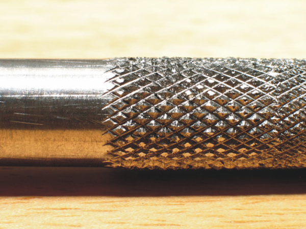
 I loved this the second I touched it. I was worried about the lack of knurling near the tip, but it turned out that just like with pocket knives, a textured handle often hides the sin of poor ergonomics. This pencil is weighty, metal, and confidence inspiring. It's not so heavy that it's hard to draw with, which I was also worried about after having had a past lead holder that was. But the weight does affect the drawing- the weight of the pencil will make a mark, and when you draw circles and straight lines it steadies your hand with a reassuring pressure that make precision drawing seem easier and less scary. I found myself not needing to hold my breath as much when drawing straight lines or precise curves. On the other hand, if you try to sketch all crazy fast it's intertia will inhibit you, slightly. I've found that I like this holder for finish pencils.

It has an integral sharpener in the lead feed button, and it works well. The pocket clip is VERY robust. You aren't going to lose it.

If you want one, you can buy it here.


Remember the entry I did awhile back where I linked to some articles about how piss-poor movie Hawkeye's archery form was? Well David Aja seems to be doing the opposite of that.  Almost comically so. Google basically any drawing of Hawkeye and these look cooler than whatever bullshit he's doing in those, I'll tell you that.

Remember that entry I did awhile back about Oblique nib holders? Here's Dennis Pachenko using one:

I'm using a Hunt Imperial 101 nib with an oblique nib holder. For the bigger letters I'm using C5 and a C6 lettering nibs. The Hunt 101 is very flexible for some line weight variation, but thicker than the Hunt 102.
I'm really intrigued by the simple and effective way Joseph Lambert conveys Hellen Keller's mental picture of herself and her surroundings in his comic biography of her teacher, Annie Sullivan. It's one of those effects only possible in our wonderful medium.

April 7, 2012

Col-Erase leads

There aren't any.

Let me back up.

So, many of you don't pencil with graphite pencil that requires erasing afterwards. Many of you use blue pencil, or red, or whatever. Because we have scanners now you can use just about any color you want to. Well anyway, one gripe many have with colored pencils and colored mechanical pencil leads is that if you DO want to erase them, they don't erase well, if at all. The reason is the wax binder they use. You can buy the fabulous Prismacolor Col-Erase pencils, but if you're like me and you both loath pencils and prefer lead holders, you're SOL because they don't sell just the leads, they only sell pencils.

Well you know me, that just wasn't going to do at all. So my first thought was, I'll just split the pencil open, carefully remove the lead, and put it into my lead holder. Well, getting it split open worked great...

...and then I found out the lead inside is 3mm wide and my lead holder is 2mm. Wouldn't fit. And there aren't a lot of 3mm lead holders on the market. So, I put out the call to see if anyone had one to spare. No one wrote back for a bit with what I needed, so I bought this one on Amazon, which is still on it's way. But in the meantime, Comic Tools reader Alberto dug up one of his Grafitti 3mm lead holders, and graciously sent it along to me, along with a ton of other goodies. Look at this load!

Included in the package was, appropriately, a non-photo blue pencil,


a whole bunch of leads in various unusual packages, including this flippy door one,this wooden one,

and this very unusual pack of short leads in what I can only describe as a cardboard blister packet:

He also sent the replacement guts for two sizes of Staedtler Marker.
So here is the extracted lead, and the pencil to fit it:

And here they are together. Exactly what I wanted!

So what I'm gonna do next week is review the two lead holders against one another, since they're actually still both for sale, and see which comes out on top.

In the meantime, my great thanks to Alberto, you are too generous!

Oh, and it looks like someone tipped Jesse off about my attempt at fundraising for his podcasts. Thanks, whoever! See you next week!

March 25, 2012

This week: The perfect pen?


Sarah Glidden says this may be the perfect pen. From her review:
"Well, the search is over. I found the perfect pen. Let me rhapsodize about the Carbon Desk Fountain Pen. I will need no other pen now. Its waterproof, has a fine line, the ink flows perfectly, and it only explodes and gets ink all over my fingers every once in a while."
Additionally, from her facebook post about it:
"...and I did not mention that I found this pen by describing my perfect pen to the guy who works in the pen and ink section of Senellier, the greatest art store in the world, and that, with a twinkle in his eye, he held up the pen and said 'this is what you are looking for.' I took the pen and tried it out on a scrap of paper, mesmerized by the lyricisim of its line. 'Yes, this is exactly what I was looking for!' I exclaimed. I turned around, smiling, to thank him, but there was no one there. 'Maybe it was all a dream," said the pen.'"
I haven't bought and tested the pen yet, but Sarah draws on the go all the time, hopping country to country and drawing prolifically. She's field tested the thing better than I ever would for a review. Waterproof fountain pens aren't just hard to come by, they essentially don't exist. The Japanese were the first to develop pigmented ink ground to finely it wouldn't clog a brush pen, which is why all good brush pens with waterproof fade proof ink are from Japan, and I presume that technology has something to do with the ink in this pen. You canNOT just go shoving regular drawing ink into a fountain pen. Years ago I used a cheap ass, old broken plastic fountain pen for lettering, that I modified to (sort of) allow it to use brush pen cartridges with minimal clogging. It was one of my favorite tools. It did eventually clog, though, and that was that. I wonder if this tool would fit that role? I currently use pointed sticks for lettering, as some of you may recall.


This is a great interview with long time super friend of Comic Tools Brian Lee O'Malley. He's asked how be broke into the business, and he lays out the events of his career from it's very beginning to show that he did not "break into" the biz, but just like everyone else, he built up a body of work over a period of lean, agonizing years, until finally a combination of whim and luck blew a part of the enormous ember he'd created into flame.
"In late 2008 and into 2009 I actually made money off of comics - see, each book comes out and people talk about it and some people heard about it for the first time so they go buy the first book, then if they like it they have to buy the other books. Doing a series adds up over time, if you can keep it up and stay semi-popular. ... There is no advice here, there’s no “breaking in” tips, that’s just how it happened for me. A little bit of talent, a lot of perseverance and hard work, a lot of luck."

In reference to last week's post, boy did this artist ever get the bow form right! And look how badass it looks!


By the way, if you're the sort of person who wastes your employer's time by surfing the web at work and you're mad that I posted an image above that might not be appropriate for the environment where you shouldn't be web surfing in the first place, you should take a look at this post by Warren Ellis, which perfectly captures how I feel about the matter.

January 18, 2012

This week: HOLY CRAP HAVE YOU SEEN THIS ZYGOTE BODY THING?!


I recently updated my operating system, because the only things it was working with were my out of date software. My browser didn't work anymore, nor my email, nor parts of many websites. But it's not exaggerating to say one thing that pushed me to spend the money was my desire to test out Zygote Body, formerly Google Body Browser. It's a fully rotatable, searchable, zoomable, fadeable, and layered human body that you can search much like Google maps. Programs like this used to cost $6,000 , and they weren't usually this good. This costs nothing and it's fucking amazing. Even the fact that my old copy of Photoshop doesn't work anymore doesn't bug me because I have access to this amazing resource, and now I can share it with those of you who haven't been using it for months already.

In Zygote Body you can rotate the figure:use a slider to fade through several layers of muscles, or organs, or whatever, depending on the body system to choose:
You can select any muscle and it will identify it with a label, single it out, and from there you can still rotate it to see the muscle from any angle, allowing for an incredible level of understanding of where and how it fits into the rest of the body. No physical model could ever allow you to see the underside of every muscle while also allowing you to see that muscle in the context of the rest of the body, at the same time. It's incredible.

Even some organs are fadeable into different layers. Yes, that's the MOTHERFUCKING VENTRICLES OF A HEART, WHICH YOU CAN ROTATE AND LOOK AT FROM ANY ANGLE. HOLY FUCKING SHIT.

This is knowledge that Leonardo da Vinci spent his life trying to catalogue and STILL didn't get it all right, for FREE. This is a goddamned miracle, it's the sort of reason the internet should exist. There mere existence of something like this is like a gleaming trophy for hundreds of years of work by thousands of scientists all over the world. If they could have swallowed the idea that something like this would ever even exist they'd have cried and/or gone insane with joy, which is basically how I feel. If you don't spend hours just playing with this you have no soul, and if this doesn't become one of your most important resources you're a fool. This is the best tool I've ever reviewed, period.

But that's not all this week!

Illustrator Yuko Shimizu interviewed some other illustrators about illustrating!

Look at these amazing webcomics! They're so good just reading them is an education!

I love the different kinds of drape in the fabrics of the different pants in this drawing by friend of Comic Tools, Joe Lambert. I also love all the different shoes.

See you next week!

November 30, 2011

This week on Comic Tools: Oblique Nib Holders
James Gurney did most of my work for me this week posting about oblique nib holders. (He says pen holder, I say nib holder.) It's the tool to use if you want to draw lots of slanty lettering without ruining your hands. He even carved his own out of wood so it's fit his hand better:

It turns out, a company named Yoropen makes oblique ballpoint pens and pencils:

According to testimonials on the site, oblique pens and pencils have distinct advantages for many people. In the case of left-handed people, they allow the writer to see their work, and to not have to hook their hand over awkwardly as they write. They're said to promote a more correct grip in small children learning to write, and aid in letter formation. Their ease in grip is also said to be helpful to people with weakness in their hands, such as stroke victims, and people who suffer from writing strain. I'd like to get ahold of one sometime to try it out. I'd also be curious if an oblique nib holder helped left-handed cartoonists ink better. Anyone out there tried it?

They also make oblique nibs (also called elbow nibs) that fit in a regular nib holder. They look like this:

And now for some extras:

One of my favorite things on the internet is Vera Brosgol and Emily Carroll's series of drawings called Fashion From Old People. This blog is a fantastic resource to see how to really dress characters in clothing. They take a real dress from a photo, and then fit that dress to a cartoon character. I save every other drawing to my morgue (That's an old-fashioned illustrator's term for an illustrator's personal catalogue of reference and inspirational images) because I have trouble drawing overly generic clothing on characters, and seeing the different body shapes and types Vera and Emily fit the dresses to, and how the woman and the dress change one another, is always an inspiration to me.


Another one of my favorite things on the internet is when cartoonists post video of themselves working. Well, here's two great tastes that go great together: Vera drawing one of her FFOP posts. There's a LOT of great process stuff here, especially for people who draw all or partially digitally.

How ballsy is Schweizer's inking in this panel:
See you next week!

November 13, 2011

Best nib holder I've seen:

Tachikawa Comic Pen Nib Holder - Model 36 - White Grip


No surprise it's from Japan, where drawing with ink tools is still so large an industry that nibs and other inking tools are still made with quality. I have several friends who've switched to this and they just love it. One really cool thing is it accepts crowquil/mapping nibs, which have round, circular bodies like this:
as well as regular nibs, which are concave troughs of metal like this:
Most nib holders can only accept one or the other, and the holders for mapping nibs tend to be thin, exacerbating strain during fine work when using a tool used almost exclusively for fine work. The Tachikawa's thick body reduces wrist strain, and the rubber grip makes it easy to hold. Nibs sit securely in it, but the plastic isn't as rigid as on a Speedball holder, so you don't have to jam nibs in or strain to pry them out again.

Jetpens.com also has a fantastic selection of Japanese cartooning nibs, the best money can buy, unless you go antique hunting. (Fun fact about the two brands of Manga "G" nib: they're literally made across the street from one another. Both factories buy the same steel, mill it on the same machines, and put different brand stamps on them. They're otherwise identical, sort of like Olfa and NT blades, also made in Japan in neighboring factories using practically identical methods. NT's cutters are way better, though.) They also stock the sometimes hard to find Pentel Pocket brush refills at a not-bad-not-amazing price, and sell the brushpen itself at a pretty amazing price.

The Tachikawa is well worth the six bucks, being comfortable and well made, and would be the only nib holder you ever had to buy in your life.

February 13, 2011

This week on Comic Tools: Futzing with nibs

I'm insomniac tonight, so I'll type this sucker up now:

A few weeks ago MK (Remember MK? Started this blog? Wrote the fantastic comic Americus, illustrated by Jonathan Hill, to be published by First Second later this year, which you can now read in webcomic form? That MK.) wrote me with this:

"Hey Matt. So possibly right under your feet all day at work are these scroll nibs, which are usually used for making filials and jazz for fancy calligraphy. Also, at the very bottom, is a thing called a music nib, used for making musical notation lines, it is made by Brause, not Mitchell, so it won't be in the kit. I got mine from scribblers in the UK after seeing them in someone else's catalogue, and I assumed they must be hackable for cartooning short cuts. Double vision, quicker hatching for bgs that must be covered in them, plaid shirts, checkerboards... the list is not gigantic, but you can get some interesting results. I'm not entirely certain that they are in NY Central, but I believe I saw mitchell caligraphy kits hanging over the doorway to the little room the G nibs are stored in, so if you see them, you could probably come up with some ingenious use for them that I am missing. I've used them for a bit of grass in the new comic already, and it was delightful to use something a little different."

She included this photo:


Indeed we do have these nibs downstairs at New York Central. If you walk straight into the store about halfway, you'll see these cheesy looking beige cardboard bubble packets sitting way up high where the managers sit:


You'll have to ask for someone to help you reach them, unless you're seven feet tall. These are what the packets look like up close, and what they cost:

New York Central got the whole lot of them in a buyout of another closing supplier, so once these are gone, they're gone. Fortunately, for anyone who might want them, they don't seem to sell well. Anyhow I've got them back at home now, and I've been playing around with them. I've narrowed it down to 8 that produce various effects I like, and I've been futzing around with them, like MK did.

My first impressions are that either these types of nib are either all made of unusually crappy and thin steel, or that the tinyness of the individual nibs having to share the space makes them weak, much like too many babies sharing a womb, or that this particular brand may just be crappy. I don't know, but nonetheless I've found some uses for these that might induce me to buy more anyway.

The nibs with evenly spaced, equal-sized points make hatching large areas really, really easy and SOOOOOOO much faster. They also make great speed lines.

The evenly spaced nibs with one point larger than the other make pleasantly dynamic and perfectly spaced pipes, dowels, poles, and rope. If I wanted to to an entire series of knot-tying illustrations, one of these nibs would very possibly save me from insanity.

The nibs with multiple slits cut going to the same point hold extra ink like a lettering nib while remaining flexible like a quill, and so far the best use I've found for these are really fantastic willowy tree limbs that you can draw with the line variation of a brush, but with a line quality that is unmistakably of a nib.


Anyhow, I'm gonna mess around with these some more and then do a proper post on them.

Finally a link: A fantastic interview with Mike Mignola about setting and architecture. One lesson learned: you neither need to like drawing, nor even actually draw, straight lines or perfect perspective in order to draw houses, cities, and other settings in a convincing and lively way. Slanty lines and age are your friends.

See you next week!

December 19, 2010


This
week on Comic Tools: Eraser Shields

In the course of penciling comics, sometimes you end up with little distracting lines that you want to get rid of, but they're so close to lines you want to keep that erasing one might accidentally erase the other. It's a common problem when drawing fiddly, intricate things like faces, or as I've chosen for this example, skulls.


My usual solution to this problem is to form a point on my kneaded rubber eraser and use it to erase only the lines I want gone. If you do this, make sure your point isn't long and floppy like this, or you won't be able to press on it hard enough to erase.

Make the angle of the tip as obtuse as you can, and the tip will hold up to much harder erasing before losing its shape.


However some artists, like my girlfriend, press their pencil into the paper like a marine trying to stab through body armor, and kneaded rubber erasers aren't enough. Here's her eraser, worn to a blunted nubble:

How is she to erase single lines with this, without erasing everything around them? That is where eraser shields come in. An eraser shield is just a paper-thin piece of steel slightly larger than a credit card, with holes of various shapes and sizes cut in it. You cunningly select and position the holes to mask off the lines you want gone, like so,

And then erase them.

You have to be careful about checking your placement, though,

lest you remove lines you in fact want to keep:

They really ought to make these in clear flexible plastic for better positioning. It wouldn't be too difficult to make one out of acetate, though. Any material that was thin and stiff enough would work.

Anyway, here's the cleaned pencils,


And heres the skull all inked up:


Sorry I haven't been getting to comments yet, my keyboard is broken and my spacebar has been dead all week. I've been inserting every space by copying and pasting, writing this. I have a friend with a new one, though, so hopefully that'll be sorted out soon.

See you next week!

January 11, 2010

This week: Brush discussion, and turning Patton into the Moon.

First off, for all those concerned, my fingers have healed creepily well, to the point where I have fingerprints back except on a very tiny bit on my thumb, and they're growing in there too. If you want to see what they looked like after one week, click here. Do NOT click if you're squeamish at all. My thumb, which got the deepest cut, is still a tad tender, but they're both up and running with honest-to-God skin. The skin was really dry until the last few days, because my new sebaceous glands hadn't grown in yet. Now I can sweat and produce oil, so it doesn't look like I have crazy localized eczema.

So, there was a lot of conversation about last week's topic and my retraction of my endorsement of Rosemary and co's brushes, and I'd like to discuss and clarify a few things about that, while also rolling in a couple items that Chris Schweiser gave me to review when I was at SCAD Atlanta.

In the comments Kiel provided a link to a fantastic primer/comparison on five different name brand brushes on artist Mike Crowell's site. Mike has, without reservation, the worst artist web page I have ever seen in my life, which is saying a lot, which makes it all the more bizarre that this amazing tutorial is just sitting there amongst the 4 other pages of his site, which include a home page consisting almost solely of a terrible photo of him, an art page with 2 pages of art, a page with nothing but am email address, and a links page. His brush lesson is as good as the rest of the site is bafflingly poor, and I learned some new things from it. It also serves as a great primer for the point I want to make, which is about consistency and/versus quality.

Mike's brush page confirms yet again what I and many others have always said- they don't do it often, but when they do, Windsor and Newton makes the best brushes in the world. But if you just broke/lost/ruined your brush and you need one NOW for a project, you can't afford to go to 3 different stores and try every brush looking for one that works, and possibly not even find one. (This has happened to me- twice.) Everyone I know who doesn't use Windsor and Newton either never used a great one and abandoned them early, or used them for years until the quality control dropped so low they got frustrated and jumped ship. But the fact is, there are people out there still using 20 year old W&N brushes. I've used my #3 like I hated it for 6 years now and it's still as good as new. Windsor and Newton , a GOOD Windor and Newton, is a mythical beast, the brush that all other brushes aspire to be. As a brand, they suck and are FLAKY inconsistent.

Raphael is the brand most people jump ship to, and with good reason. You still need to test them, but their QC is much better than W&N. You can actually find a working Raphael brush in one store stocked with them almost every time. If you ordered five I'd give you great odds more than one would work. And their best brushes are just a hair under a good W&N, which is like being a shade slower than the Millennium Falcon but not breaking down nearly as much.

The reason I was so excited about Rosemary was not that they were amazing quality brushes- they're not. They are perfectly effective, however. A good Rosemary brush is like what I'd picture a solid military issue brush to be like- it lacks finesse, but it's solidly built and in skilled hands will get the job done. Rosemary brushes won't hold as much ink and have less spring than better brushes, but because every single one I and everyone else ordered was a perfect example, I recommended them because she was the most consistent. Rosemary brushes were, I thought, the first brushes I'd ever seen where you could order ONE brush and get a working brush every time, guaranteed.

But now I semi-frequently have reports sent to me of people ordering brushes from her that are a little off. Now, sure, she has a policy that she'll replace anything you're not satisfied with, but the point was, she was a slightly lower quality but still good brush that I was recommending because of their insane consistency. So if she lacks the consistency, and she doesn't have any edge on quality, why the hell not just tell you to rummage through the art store for Raphaels?

So it is on that basis that I retract my endorsement. I say put your effort and money into a higher quality brush. You really do get what you pay for with brushes.

Mike's brush page has a section towards the bottom about identifying quality brushes that's more specific and informative than anything I've ever posted, so you should read that, maybe even print it out and take it with you when shopping. He inspects every bristle, and if you've ever used a brush you know that's not fanatical- one splayed hair will ruin a brush. It's like a grain of sand in a Swiss army knife.

According to Mike Raphael and Scharff brushes are essentially identical in constriction and quality control, so if you need to dash out to buy one they'd both be good choices. I have never heard of ANYONE being disappointed with either. However, because mora brands means more likely hood you'll be able to find a brush if you need to find one fast, allow me to toss in a brand that's only become recently available in America, but which seems to be in growing demand amongst the students at SCAD's Atlanta campus: the Escoda, made in Tajmir, Spain.

Here you can see the #2 Tajmir on top, over my trusty #3 W&N, and my #2 Rosemary. Click to see the image larger.
I wish I had a #2 Windsor to show you how the belly's compare better, but you can see that the Escoda has a better belly than the Rosemary, though not as much as the W&N.
A simple line test showed that indeed, the Escoda holds far more ink than the Rosemary. I wish I could compare it to other brands, but I don't have any. It feels to me slightly wispier but just as springy as the Raphaels I've tried. It's a good brush and several SCAD Atlanta students and faculty seem to just love them. Chris claims the quality control is very good on them. Look for them if you're ever out brush hunting. If nothing else, it's another good option that increases your chances of coming back home with a tool you can draw with. While I was there Chris also gave me a bottle of a new Japanese ink I'd never seen nor heard of that's carried in a local art supply store that caters to the cartooning students. It's called Holbein ink. According to their company profile they started in 1900 a a Japanese company producing "European" artist materials (They do not elaborate), which presumably explains why they chose a German name. Like everything I've ever bought from Japan, the ink bottle comes in nifty, crazy sturdy plastic packaging that you don't have to destroy to open.

Here you can see the Holbein logo in a calligraphic font, with an Iron cross over it, because I guess that's what the Japanese thought people would think was German at the time.
As usual, I LOVE Japanese infographics.
The ink is one of the best I've ever tried, continuing Japan's total dominance in modern ink making. It's matte and deeply black, sort of like Dr. Ph. Martin's Black Star Hi Carb ink. I like this ink a little better. If you can get ahold of it, definitely try it. My understanding is that it comes in two thicknesses, this one, and another that is very thick and actually needs dilution before use.

Changing subjects, remember how I said you'd crap yourselves when you saw what was delaying me? It was Two large poster projects, one of which I can't show you just yet, but the other of which is finished, and I'll share it's making with you below.

First off, some of you may recall a ways back last year when Patton Oswalt had me do this poster for a show of his:


Well, he liked that one so much had asked me to design the postcard for another show.

I needed a fairly simple design that would read easily at a small size, and something that would force people to look at it, which as every artist knows means face, eyes, hands, boobs or any nudity. Patton has a fantastically expresive and distinctive face (He's one of the comedians who I think almost all of his fans know what he looks like), so I decided to go with his face. Plus, I already knew how to draw him, so that would save time.

You can now follow along with my process by matching the numbered paragraphs to their matching numbered picture:


1: This was my first doodle of what would turn out to e the final composition, although I did more than 30 other drawings to make sure, as is usual with me on illustrations. Illustrations aren't as intuitive for me as comics, and require a lot of planning. I throw away a lot of work doing illustrations. Obviously, the concept is to have his head be the moon from "La Voyage Dans La Lune." The twist is that the rocket in his eye is actually the LCross rocket stage that was launched at the moon to look for water. It took me 3 hours to find 6 good, accurate images of this goddamned thing:
The probe is the gold thing on the top.

2: This was a computer sketch I did to establish the basic lettering shapes in the title, which was to be hand-lettered, and of the overall image. I like using digital when I have to do a lot of drafts to figure out black balance but not necessarily a lot of redrawing.
3: I penciled his face and then found myself stuck for about 2 days as to how the hell to make him look like his head was the moon without making him look like he had a terrible skin condition. Nothing was working. I got really frustrated with the delay when Patton wrote me asking if it was done so he could post it for New Years and I had to tell him no.

4: Finally, I figured it out and successfully tested it it on the computer: instead of making his head the moon, I'd do what the original filmmakers had done- apply the moon like a mast around his head, with his head sliiiiiightly pushing out from the moon, so you can still barely still see his original jaw line, but then stretching his hairline and ears out to the edges of the moon. It worked perfectly- still recognizably Patton, but looking like the moon from the film.

5: Next came the pencils, for the drawing, border, and hand lettering.

6: Then came the inked lettering, which you see me holding here for scale:


Hand lettering is generally drawn large when a very smooth finished product is needed; reduction eliminates any mistakes. I also added in the rest of the lettering, a tedious process, because I wasn't using a computer font, but rather an old font that I'd scanned in and modified slightly. I had to place each and every letter by hand.

My girlfriend swooped in and gave me some help with this- she is absolutely excellent at spacing type, and her adjustments made all the difference in the world.

I emailed Patton about whether his current hairstyle matched the one I used in this drawing, but he never wrote back. As it turned out I didn't need him for that one, because that very night he was on the Tonight show, and I was able to see his hair there and adjust my drawing accordingly. (I ended up making is a mishmosh of about 4 similar hairstyles like his current one, figuring it would be more recognizable to average them.)

I had an incredibly odd moment inking the drawing. I was getting fristrated drawing the Lcross booster and I decided to move in to his face for a bit to relax (I like to eat my veggies before my meat, so to speak), and as soon as I started inking his eyebrows Patton called in live to the Best Show on WFMU, which I was listening to, so suddenly I was getting Patton through the eyes and in the ears at the same time. My night suddenly became a Russian Nesting doll of Patton. I tried emailing him to see if I could get him to talk about how I was listening to him and drawing him at the same time while he was still on the air, but he didn't get it till after. It was worth a shot.

It had been awhile since I inked anything, and in my rustiness I over-inked the left side of Patton's face, requiring me to lightbox that side and re-ink it, as you can see here: 7: I drew the border with a thick bamboo skewer and then inverted the image in photoshop.

8: And voila, the finished product, which you can see better below: (Click to enlarge)
I'm pretty damned proud of it. It's by far my best lettering job, and I love the composition.

I look forward to when I can show you the other poster I've been working on. It's still in development right now.

Finally, I thought you all might like this funny shot of me looking out of the eye window in my camera mask, which allows me to look at things for real and not just through the camera's rear screen. Next week: My visit to SCAD