This week: Dogs are clenching rocks in their paws.
This post was inspired by a tweet by Elanor Davis about 2 weeks back. She tweeted "Before I die I hope I'll be able to draw a dog leg without getting super confused halfway through."
Animals and their weird anatomy can be really hard to draw out of your head, and Elanor's post prompted me to do two posts on hard to draw animal stuff. I decided I should do one on the horse, which was last week's post, because EVERYONE has trouble drawing horses, except a few freaks of nature that leave the rest of us seeing through green lenses. (By the way, was the horses post helpful to anyone the way my people anatomy ones were? Haven't heard any feedback on it yet.) Now this week, this one is dedicated to Elanor.
So, here's a wolf skeleton, the platonic ideal of a dog shape. Compare it to the structure of a horse and you'll see it shares a lot of characteristics, but there are differences too. Just like with the horse the curve of the spine is actually convex but the vertebral ridges make it seem concave. The pelvis is a lot narrower but has a similar structure. The ankles and elbows and lower but the general idea of how they're arranged is similar. And the tall, narrow ribcage and long downswept shoulder blades are almost the same.
Here's a great illustration of the leg from many angles:
Now, I won't dwell on the body much in terms of shape and proportions, and I'll tell you why in just a bit. But I will say that just like with my horse post, unless you want to draw really realistically, you only need to know where masses of muscle start and end to get the shape of the leg right. Here's the basic shapes of the skeleton: And here are the start and end points for the muscles. Notice that they're basically the same as the anchor points for human muscles? Our quads start at our iliac crests and go just below our knee joint, and so do a dog's. Our hamstrings start at our ischiums and go just below the knee, and so do a dog's. The muscles at the back of our arm start at the shoulder blade and attach to the humerus and elbow, and so do a dog's. We may be all twisted around but we're all built on basically the same plan. Now, I said I wouldn't get into proportions or shape too much, and here's why: through breeding we've twisted dogs into all sorts or forms. There are no set proportions for a dog. Researching this post I found a great website called skeledog.com that sells t-shirts depicting the skeletons of many popular breeds of dog. Here's a couple examples:
Now, these don't conform to wolf proportions at all, but they do conform to my start and end points. All of them, no matter how weird. Muscles still pull on pretty much the same places, no matter how those places are arranged, or in what animal.
Once you know how to fill in the masses of muscle the tops of the legs are pretty simple. What I think is by far the most confusing bit of a dog are it's paws. There's all these little bumps that look like joints, digits poking out of weird places in the middle of it's leg, it's total mayhem. Sort of like with neck muscles, it's really not so complex, but if you don't know what's underneath it's sort of hard to parse what the hell is going on. So let me offer you a clear, easy to remember description that will aid your memory: dogs are always clenching five rocks in their tiny, withered hands.
Just follow me on this one. Here is a human hand in several poses, and next to it is a dog hand, drawn without it's pads or it's fur: That bump on the wrist is the most obviously different thing from the human hand, but you actually do have it. It's called the pisiform bone, and on dogs and cats is really prominent. The rest of the dog's hand is actually very similar, it just looks withered. The fingers are actually shockingly long and thin, but you can't tell when the pads are on them. I've drawn them straight for simplicity, but they're actually very knobby.
Now let's add the pads: As you can see that brings us most of the way towards the hand becoming a paw right there. Note, even though the pisiform bone sticks out and UP, the top of it is covered by the flesh of the arm, (look back up the the lines you draw for the masses of flesh on the arm, the line goes down from the elbow to the top of the bone) and the pad on it actually points DOWN. The little thumb has no pad on dogs. As for the rest of the fingers, they appear to be ever clutching a handful of little rocks. When the dog stands, it stands on the mounds formed by these pads, as if they were platform shoes.
Here at last is the same drawings with the fur filled in. Now it's a paw, not an exhibit from the Mütter museum. I don't actually recommend drawing paws out like this every time, but thinking of them this way will hopefully keep you from getting confused about all those bumps and sticky out bits on the paw. Remember: dogs are always clutching rocks in their paws.
Let me know if these are actually helpful. See you next week!
March 3, 2012
This week: Draw a horse, of course. Sorry for the wait! It's been quite a little while since I did one of these anatomy posts and I forgot how much more prep they take. So!
First let me say, the mission statement for this post is NOT to give you all the tools you need to draw a perfect, realistic horse. How many of you draw in perfect photorealism? Basically none, right? So what good does that do? I won't even be giving you an overview of all the major visible muscles like I did with my earlier anatomy posts. Nope, my mission with this post is simple: make it so your horses don't come out like this: Or like some weird dog thing or whatever. My mission is to give you the tools, in the form of some basic shapes and a little anatomical knowledge, to draw a horse that looks recognizably like a horse, and not a deformed cat, in any position.
I'll start with the skull. Horse skulls seem terribly alien, and they are. They're not like our heads at all. Making them odder still is the fact that while they inform surface anatomy, they don't look like a horse head the way that a skull looks pretty much like a noseless human head. As you know, I loathe basic shapes in drawing books that act only as gestural masses. I favor teaching basic shapes that you can actually build anatomy onto, even hand muscles on if you want to, or that you can use to check the correctness of a drawing you've done quickly. My choice for the horse skull is a sort of a rounded 3-sided pyramid. The back of the skull is a flat , rounded triangle narrower than it is tall. The pyramid, which if stood on it's base would look more like a lopsided Chinese mountain, is tall and leans toward the short edge of the triangular base. The tip is blunt, blunt enough for a set of horse's teeth into. Finally, I like to draw two lines down from the acute angle of the triangle down to the end of the nose, as a visual guide both for the center of the face and to remind me that that part of the horse's nose is very narrow.
As you can see in the above drawing, my next step is simple: I extend two sets of cones out at a slant from that nasal bridge, which will fill out the structure of the horse's eye sockets and it's nostrils. Just by doing that you have all the structure you need to flesh out the head and alter the shapes as you like for the horse you're drawing. I chose this shape both because you can easily create real anatomy from it, and because it's easy to rotate in space to create hard-to-draw angles.
You can also use this shape to easily draw the skull, which is important to draw if your horse is going to open it's mouth:
The next thing you need to know about horses, and all four legged animals actually, is that their ribcages and shoulder blades are in a radically different position. Our shoulder blades are flat on our backs, and along with the collar bones form a loop around the top of our ribcage. Four legged animals have shoulder blades that point down, and they have no collar bones. Our ribcage is shallow front to back, and relatively wide, whereas in four legged animals their ribcage is taller than it is wide. The anatomy looks as if a human were squished at the sides and pulled front to back: Here's a lovely anatomical illustration to show you what it really looks like:
The most alien thing about horse anatomy (and other four legged animals) is the way huge vertebral ridges affect the contour of their back, and in the case of horses, their neck. If you feel your back and neck your spine and beck bones are pretty much near the surface at the back, right? Not so with horses. a huge ridge of vertebral bones between their shoulders (called the withers by horse people) sticks way up from their back, and huge muscles extend from there to the back of the head. This means the neck bones are buried closer to the front of the neck than they are the back. Furthermore, even though the line of a four legged animal's spine is a convex line, the shape formed by this ridge makes a horse's back look like a concave shape. Another ridge of vertebrae, along with the pelvic bones, make the back higher, making the spine seem even more concavely curved. But it's not. You can see these two ridges VERY clearly in the photo of this horse:
His spine is almost straight in this pose, but it looks bent because of these structures.
Next we'll move on to the pelvis. As you can see, the pelvis is the widest part of a horse:
But from the side, the pelvis is so this you can basic shape it as if it were a sheet of cardboard and not lose much accuracy. Which is exactly how I treat it. I draw the pelvis as a triangle of cardboard that's had it's end nipped off, and a fold made in it about 2/3-3/4ths of the way to the narrow side. The two sides of the fold get balls glued on representing the hip sockets. With this shape, you can draw a horse's rear in absolutely any position. Remember that the tail passes under the top of the hips, curves over it, and the tail hangs down past the end, like in the drawing below:
Those are the basic shapes you need for the body. For the legs, well, I can get you started, but those, like human hands, demand study and practice. There's no way around it. It does help to remember what joints on the hose correspond to which joints on a human, however:
Now let's put these all together. Here's a horse I sketched with these basic shapes: And here's how I drew him, step by step: Note that the shoulder blade sweeps way forward an an angle, it doesn't just point down. And the short, stumpy humerus sweeps back an an equally aggressive angle. The elbow does not go below the ribcage pretty much ever, and it can't extend hardly at all. Unless you're drawing a horse in an extreeme position, you should draw the shoulder blade and humerous as if they were an almost immobile, rigid structure. Note how the back of the elbow sticks, way, way up, to give the muscles that will sweep down from the whole shoulder blade a big handle to pull on. You need to draw this so when you draw the huge lump of shoulder muscle it looks basically right. When you fill in the muscles, remember that you know about human anatomy. You know the calf muscles pull on the bottom of the femur, so just draw a line from there to there. You know the quads pull from the top of the pelvis, and the butt muscles from the sides and bottom, so draw lives from there to there. The idea here is not even so much to get exact muscles right, but to make the structure fit together in a way that comes out making sense no matter what lose you're in. If the leg is bent or stretched, the muscles start and end in the same place, so a line drawn between them will pretty much look right. Horses actually have fat little pectoral muscles which make their chests poof out a bit at the base of their necks, so make sure to draw that. Same deal, remember your human anatomy: from the sternum to the humerus, right? Same thing, just no collar bone. Some really basic proportions will help keep you in check. I hate books that list people's bodies in terms of head measurements, both because the head is round and uneven and there's too many heads to really visually count. I can't picture seven heads very easily and I bet neither can you. But horse heads and nice and big and long and straight, perfect for measuring their own bodies. Here's a diagram, and below some helpful proportions:
The ribcage is about 1 head tall, 1.5 heads long, and 3/4ths if a head wide.
The body, chest to ass is about 2.5 heads long.
The neck, if you uncurved it, is about 1.5 heads long, and ends up being about 1 head away from the body.
The pelvis is about 3/4ths if a head long, 1 head wide.
The distance from the elbow to the ground is 1.5 heads. (Makes sense, right? If it were farther the horse wouldn't reach when it fed. Horse legs are proportionally shockingly small.) If you draw a line half way down from the elbow, the front leg "wrist" is just under it and the back leg "ankle" is just over it.
The "knuckles" are roughly the same level above the hooves.
If you're concerned about drawing the legs sticking too far out, a circle drawn with it's center as the elbow in the front and the hip joint in the back, with the standing leg as the radius, gives you pretty much the full range of motion.
One important point is that the "wrist" joint cannot flip forward, it only bends backward or locks straight. Even with the leg extended forward, the shoulder joint never unbends very far, as you can see in this photo:
The proportions will vary between breeds of horses, and horses of different ages. Foals have tall skinny legs, draft horses are stockier and stubbier. But these proportions will give you a horse that's basically horse like and not a cow crossed with a kangaroo.
Finally, there's the issue of where to put the horse's legs. Well, that depends on the speed they're going. Again, like with drawing hands, knowing the basic anatomy will help you, but you need to draw them and look at them carefully to get them right. I think the most useful thing is slow motion videos of horses in different gaits. Horses actually change their leg arrangement completely at different speeds, so you need to know how fast you want your horse going before you can figure out what the legs will be doing. Here's some great videos I found at 3 different speeds: walk
trot
gallop
Note that these don't cover fancy military gaits or anything.
Finally, a few details that people often get wrong:
Horse ears are straight on the inside edge, rounded on the outside edge. They can swivel them around to show different emotions.
Hooves don't stick out on the front and back. They mostly follow the line down from the "knuckle" in front, and in the back they curve out.
Sometimes, they can bend their "finger" back just above the hoof, like on the bottom left.
I'll end with a behind the scenes treat, a photo of all the horse drawings I did in research for this post: Next week I'll be back to explain dog's legs. Seeya!
January 18, 2012
This week: HOLY CRAP HAVE YOU SEEN THIS ZYGOTE BODY THING?!
I recently updated my operating system, because the only things it was working with were my out of date software. My browser didn't work anymore, nor my email, nor parts of many websites. But it's not exaggerating to say one thing that pushed me to spend the money was my desire to test out Zygote Body, formerly Google Body Browser. It's a fully rotatable, searchable, zoomable, fadeable, and layered human body that you can search much like Google maps. Programs like this used to cost $6,000 , and they weren't usually this good. This costs nothing and it's fucking amazing. Even the fact that my old copy of Photoshop doesn't work anymore doesn't bug me because I have access to this amazing resource, and now I can share it with those of you who haven't been using it for months already.
In Zygote Body you can rotate the figure:use a slider to fade through several layers of muscles, or organs, or whatever, depending on the body system to choose: You can select any muscle and it will identify it with a label, single it out, and from there you can still rotate it to see the muscle from any angle, allowing for an incredible level of understanding of where and how it fits into the rest of the body. No physical model could ever allow you to see the underside of every muscle while also allowing you to see that muscle in the context of the rest of the body, at the same time. It's incredible. Even some organs are fadeable into different layers. Yes, that's the MOTHERFUCKING VENTRICLES OF A HEART, WHICH YOU CAN ROTATE AND LOOK AT FROM ANY ANGLE. HOLY FUCKING SHIT. This is knowledge that Leonardo da Vinci spent his life trying to catalogue and STILL didn't get it all right, for FREE. This is a goddamned miracle, it's the sort of reason the internet should exist. There mere existence of something like this is like a gleaming trophy for hundreds of years of work by thousands of scientists all over the world. If they could have swallowed the idea that something like this would ever even exist they'd have cried and/or gone insane with joy, which is basically how I feel. If you don't spend hours just playing with this you have no soul, and if this doesn't become one of your most important resources you're a fool. This is the best tool I've ever reviewed, period.
You all should all already know about this week's topic, which I heard about on James Gurney's blog, because I've told you many a time about how great and useful James Gurney's blog is. I post things from it all the time, it's in the links sidebar, and any of you who aren't subscribed to it are fools shooting your artistic education in the foot.
So, being as you already read this post this morning when it popped up in your blog reader, I'll skip to saying that it intrigued me so much that I bought the video and found it to be worthwhile enough to recommend that you do the same.
Yes, I know, it's 39 bucks. Yes, that's a lot of money. Last year was the first year in three years I had to even file income taxes, having made an average of $8,000 a year after gross adjustment in those years, and this year I'm a clerk working for $9.75 an hour, so I don't wanna hear any clamouring about anyone else's budgetary constraints, especially not from anyone with a smartphone, or who buys coffee with any regularity. For 39 bucks you're getting more information than you'd get in three decent hour-long collage classes, from a very gifted professor, for way, way less money than you'd pay just for the lecture time, let alone the cost and time expense of putting together the graphics for the videos. These are worth the cash, if they suit your needs.
The videos do for basic animal anatomy what I endeavored to do for human anatomy in my anatomy posts (and will continue to do, several more coming at an undetermined time), but from someone much more expert and gifted than myself. His insights into simple but profound differences in quadruped and biped anatomy were revelations to me, in that way when you hear someone perfectly articulate a concept you've only barely understood by instinct. After watching these videos, I will look at animals and my approach to drawing them on a wholly different way.
I have a small issue with his basic shape exercises. I notice that he has a tendency, like many instructors, to assign beginner students different basic shapes for learning anatomy than they themselves use when drawing, which I feel hampers rather than enhances understanding of shape and ability to construct. However, he makes up for it by reversing the usually backasswards process I see in so many well regarded and in my opinion useless how to draw books by encouraging you to start with a gestural sketch, and use basic shapes to help you true the parts that seem off. Or, to use them as a separate intellectual exercise altogether. He's also very clear that you may use any basic shapes you like that help you understand your drawing better.
He's a gifted instructor, and it shows in his student's work, which is sprinkled all through the videos. You can tell he's taught them to really SEE differently. The music in the videos is ridiculous, but evidently it was composed by his son, so what can you do.
If you're someone who's ever had trouble drawing horses or realistic cats, which is everyone if we're not lying to ourselves, you really should invest in this tutorial.
Speaking of horses, I love these drawings from Fabio Moon showing the thumbnail drawing for a panel and the final artwork. This is what it means to take an adequate composition and push it into a good one.
Mark Kennedy posted this great analysis of how one out-of-place element in your art can throw your entire reality out of whack. Seriously, what was the artist thinking with those damned stars?
So, it came up several times this last week with several coworkers, who in my case are artists, that they didn't realize the bones in your hand don't bend in the location illustrated in the title. I can sort of see why someone might think it, so I'm just gonna toss this out there for people. In fact, your bones don't bend at either that line, nor the line seperating the palm from the fingers. The pad at the top of your palm actually comes both a little above and a little below your knuckles. Your knuckles are roughly in the middle of the pad, as you can see in the illustration:
So when you bend your fingers down, the pad, which makes the bones in your palm appear longer than they are, gets bent down. This makes the palm seem to shorten and makes it look like the palm bones themselves must be bending. The phonomenon is easier to understand from the side:
If you really want to prove it to yourself, fold your hand while looking at the back. You will see that the back does not change in length at all.
Knowing that the pad comes above and below the knuckles also helps you draw palm lines more accurately. I can't tell you how many students I've seen draw a hand with the top fold line in line with the knuckles, who then try to fit the lines of the palm onto a palm that's too small to fit them into. It's especially a problem for young artists who draw "realistically", meaning they hatch and shade too much and observe too little. It is a problem 100% of the time for those guys who seem to know how to draw every single gun known to man, in perspective, but can't draw a back three quarter view of a head or a garment that hangs naturally to save their lives. Those of you who have been to art school know the ones I mean.
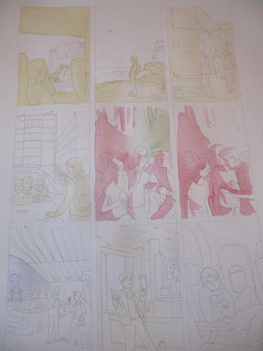
Sarah Glidden shows us how she made her wonderful watercolor comic pages. Of particular interest to me was her use of a glaze of color under SOME, but not ALL parts of the images. I've seen cartoonists like Lucy Knisley use washes of color, usually yellow, over the whole image, but the way Sarah uses it is interesting, because she uses it to compartmentalize different parts of the ground from each other.
On this example page, she uses a yellow wash to separate the foreground from the midground and background, and blue to make a background sink deeper into shadow. You can't always see these glazes of undercolor in the final panels, yet this subtle technique makes her painted panels organized and easier to read.
Friend of Comic Tools, Jason Little, wrote this fantastic post about his artwork and writing process leading up to his fantastic latest book from Dark Horse, Motel Art Improvement Service. There's so much to love about this post, like his accounting about how the story started as a misguided diatribe about the health insurance industry, or how he originally wanted to serialize the story in a series of regular comic books. He was talked out of both ideas, and the result is better for it. It's the comics equivalent of a wife saying to her husband, "You're not going out looking like THAT, are you?!"
I must say though, I love this panel from when he was contemplating doing the book in only two colors of ink to save printing costs. It shows what a master of print Jason is, that if you don't have an eye that looks for such things, you don't immediately notice this panel has only two colors. It looks so lush.
Aaron Renier talks about his process writing and drawing Walker Bean in this Newsarama interview. I have seen art from this book, and it makes me shake with jealousy just thinking about it, it's so good.
Friend of Comic Tools Chris Schweizer posts artwork frequently to his blog, and it reveals that he one one of the ballsiest inkers and loosest pencillers I have ever seen in my life. Seriously, his pencils are often less resolved that a game of connect the dots. I don't know how he does it. Here, he posts one of his most detailed penciled panels (still absurdly under rendered), and here he shows off some gorgeous setting sketches for a story. The amazing thing is, that panel isn't even his finished inks- for his comics,he renders what look like finished inks in marker, then scans them in, prints them in blue, and inks in brush over that. But I've seen him ink drawings straight from pencils that loose that looked no less finished, to my eye. Insane.
Here we have a great example of everything I stand against in art teaching, in this excerpt from How to Draw Comics the Marvel Way:
See how easy it is? Just draw a stick figure, then add cylinders, then fill it in with years of painstaking anatomical study and direct life drawing knowledge, not to mention expert knowledge of lighting, drapery, and character design. Jesus Christ, why don't they just show you a white sheet of paper and say "Just add characters here with a pencil! Pause the tape while you practice doing that."
My thanks to my good friend Emily Felger for sending me a new keyboard.
May 24, 2009
This week: Neck Muscles (and also hand resources)
It's not hard to see why the neck freaks so many people out. You look at it with the skin on and it's hard to see what's going on. Then you look at an anatomy diagram and you see what looks like dozens of tiny muscles in layers crisscrossing every which way, and you like eating the end of a shotgun.
The problem with looking at an anatomy text to see what's going on with the neck is that anatomy texts are there to each you anatomy, but they aren't prioritized for the artist, who more than likely just wants to know what muscle they're looking at, or trying to get those slanty lines in the neck right.
To actually draw a neck, any neck, you only need to know five muscles.
You heard me. Five. (Technically nine, but the first four are symmetrical, and if you can draw them on one side you can draw them on the other, just like if you can draw a left arm you can draw a right arm.)
If you're drawing more than five visible neck muscles, you're not drawing a human being. Seriously. ("But Matt, what about when I flex my neck and make all those muscles pop out? There's more than five of those!" No there actually aren't, but I'll explain later why it looks like there is.)
Five muscles. Here we go:
First, here's our plain skeleton. You'll note he has ears, and dots behind his ears (not on the jawbone, but in this drawing the jawbone covers up where they'd actually be.) Those are there to show where some of the muscles insert. That tube in back of the muscles in the picture below is your windpipe. The cartilage of the trachea is larger and sticks out more in men than in women, although there are freakish examples like Ann Coulter. (No matter what I say, I cannot convince my mother that she actually is, and has always been, a biological woman.)
First two muscles: Sternohyoid comes up from the sternum and inserts in front of the trachea. Omohyoid comes from the bend 2/3rds out on the collar bone, attaches to the top rib, and then comes up and attaches in front of the trachea. These muscles are often mostly invisible, but they become prominent in very skinny people or in times of stress, anger, and fear. 3rd and 4th muscles: you all recognise trapezius, right? Trapezius covers up a looooooooooot of muscles underneath it, making them pretty much invisible and making this lesson much shorter. Also, see how there's not really anything in front of either side of it? That gap that's left is actually a prominent feature of the neck and shoulder area, and you can actually see it in all the photos below that accompany the illustrations. The muscle that has two forks coming up from the sternumm and collar bone and reaching up behind the ear is sternocleidomastoid (say that 3 times fast), the most prominent and most often mis-drawn muscle when people draw necks. A lot of folks draw a slanty line in the neck not knowing where it comes from or where it's going to. Here's a good picture of the sternocleidomastoids from the side:
Here's what they all look like layered together. In this fetching photo of my friend Hilary Florido, you can see all of these muscles clearly. Look closely and you can actually see where her omohyoid muscle bends into her top rib: Looks like Trixie from Speed Racer, doesn't she?
The fifth and last muscles you need to know to draw the neck is platysma, a thin muscle that makes up the front of your neck. It's the muscle that sticks out and makes all those strainy lines when you try to make your "neck muscles" pop out. What looks like a lot of muscles is actually just the fibers of this one muscle.
Try not to overuse this one superhero artists, okay? Pay attention and you'll notice that even if you're straining or yelling you don't flex this muscle very often at all. Only in certain kinds of grimaces and yells. Here's someone flexing their platysma: Also for the superhero folk, note that platysma lays on either side of the trachia but not actually over it, and that it DOES NOT CIRCLE ALL THE WAY AROUND THE NECK, no matter what Rob Liefeld says. See how it only goes back so far? Yeah, keep that in mind, will you, superhero artists drawing necks?
You'd think that the neck muscles would stick out more in musclebound folk, but the opposite is actually the case: skinny people tend to have strand-like, very clear neck muscles whereas bulk tens to obscure them, as in this example: Looks like he's hiding a pineapple in there, doesn't he?
Okay, now, in the comments section a reader was begging me for a hand tutorial.
Tom has several other really intensive tutorials on his site, which can all be found at this link: http://www.tomrichmond.com/blog/tag/tutorial/ I'm gonna make that link a part of this blog's sidebar, too, it's such a great resource.
This is the last of my entries on anatomy for cartoonists, and I leave you with some hands drawn by Farel Darymple, who draws some of my favorite hands of anybody, ever: (click on them to read the comic they're from)
Next week: I'll actually be away at a funeral, but I have something up my sleeve that I've been saving for a rainy day.

 This post was inspired by a tweet by Elanor Davis about 2 weeks back. She tweeted "Before I die I hope I'll be able to draw a dog leg without getting super confused halfway through."
 Here's a great illustration of the leg from many angles:


 That bump on the wrist is the most obviously different thing from the human hand, but you actually do have it. It's called the pisiform bone, and on dogs and cats is really prominent. The rest of the dog's hand is actually very similar, it just looks withered. The fingers are actually shockingly long and thin, but you can't tell when the pads are on them. I've drawn them straight for simplicity, but they're actually very knobby.
 As you can see that brings us most of the way towards the hand becoming a paw right there. Note, even though the pisiform bone sticks out and UP, the top of it is covered by the flesh of the arm, (look back up the the lines you draw for the masses of flesh on the arm, the line goes down from the elbow to the top of the bone) and the pad on it actually points DOWN. The little thumb has no pad on dogs. As for the rest of the fingers, they appear to be ever clutching a handful of little rocks. When the dog stands, it stands on the mounds formed by these pads, as if they were platform shoes.
 I don't actually recommend drawing paws out like this every time, but thinking of them this way will hopefully keep you from getting confused about all those bumps and sticky out bits on the paw. Remember: dogs are always clutching rocks in their paws.


