August 5, 2013

Arthur Rackham: Illustrator

Arthur Rackham was one of the most famous "Golden Age" illustrators and went on to become an inspiration to a varied group of creative thinkers, including C.S. Lewis, Gulliermo del Toro and Tim Burton. Rackham created rich and believable fantasy worlds by applying a realistic style to fantastical subjects. His faeries, trolls, and animals all seem just one shade shy of human.


Rackham made his living as an illustrator for 47 years, and worked on dozens of books, but Rip Van Winkle, his first artistic and commercial success, was not published until 1905, when he was almost 40.


The story of Arthur Rackham's career is one of steady progress. He attended the Lambeth School of Art part time while working a day job as a clerk, then went on to work as an illustrator for a paper called the Pall Mall Budget, then switched to the (equally dull-sounding) Westminster Budget.

"...for the next seven years or so I worked as hard as I could out of business hours (9–5) to equip myself as an artist – not being able to embark on a professional career till I was nearly 25, & then for many years getting the barest living from my profession & having to do much distasteful hack work."
        -Derek Hudson, Arthur Rackham, His Life and Work 

For the most part, the work he did for these papers had little to distinguish it from the mass of utilitarian Victorian news illustrations generated before photography rendered them obsolete– but inklings of his future work could be seen in drawings such as "The Influenza Fiend."


His drawings show masterful control of watercolors and a tight, muted palette. He is known for his treatment of wood: the grain in beams of fairy-tale cottages; the gnarled, expressive trees.


Rackham worked at a time when printers were switching from woodblocks to the photo zinc process. Where previously the engraver would often reinterpret the artist's original lines to suit his own style or tools– sometimes gluing the original artwork directly to the woodblock as a template– this new process allowed the work to be reproduced identically, and left original drawings unharmed. This is meaningful, as the sale of original artwork was an important source of income throughout Rackham's career.


In contrast to the fairy tale worlds he drew, Rackham led a fairly conventional life. He was a Luddite and a family man, by all accounts happily married to his wife, Edyth, whose own paintings were well recognized in her time. Their studios were next to each other, and some credit her with helping him introduce color to his work.


His particular working method is described in Fred Gettings' 1975 biography, Arthur Rackham:


"Rackham would begin his pictures by sketching carefully with a soft pencil the broad outlines of the composition either working on card, or on a good quality, slightly textured, paper mounted on card… into this he would work his figures or emotive points of interest. This method of working– from established mass to to details within the mass– remained with Rackham throughout his life." 


"…into the general mass of the pencil drawing he would then work in pen and indian ink, and once the basis of the drawing had begun to emerge in ink, he cleaned off the pencil drawing beneath..."


He finished with an allover wash of color (usually sepia), then gradually intensified the colors with thin layers of watercolor– never gouache, as was commonly used at the time. Any lines which were washed out in this process he would trace once more with ink to keep them crisp in reproductions. He started out working at twice the intended reproduction size, and then started working a little larger as he earned more income from selling originals.


Rackham brought his fanciful style to a broad range of subjects. He illustrated operas by Wagner, and plays by Shakespeare. He cultivated a friendship with J.M. Barrie while working on Peter Pan in Kensington Gardens. He even illustrated an early edition of Goblin Market, a poem so loaded with erotic symbolism that it was reprinted in Playboy in 1973.


It is a testament to how well-regarded Rackham was in his day that he was asked to illustrate new editions of The Wind in the Willows and Alice in Wonderland– two books which were already quite well known for their illustrations.


Some of the illustrations he originally published in black and white were later republished in color. But you can see here how the color is not necessary for definition of the subject- the linework stands quite well on its own.


Part of the difficulty in researching his work was that many of his illustrations were oversaturated for reprints or the web; it is difficult to find digital images which faithfully reproduce his intended hues. 


Sales of fine illustrated books lagged in England after WWI, but in the US, the market was booming. And luckily, his original artwork continued to sell briskly despite England's economic malaise.

Rackham worked at the peak of his ability right up until his death in 1939. He finished the illustrations for Wind in the Willows while suffering from cancer, driven in part by his lingering regret over having had to turn down the project 20 years prior. 


Derek Hudson's book contains this lovely anecdote:


"Slowly the drawings for The Wind in the Willows neared completion. The last drawing of all to be finished was that of Rat and Mole loading their boat for a picnic. Rackham's daughter remembers his great exhaustion and the extreme difficulty he had in getting it done. When he had, as he thought, finished it, he suddenly discovered there were no oars in the boat. Barbara (His daughter) tried to persuade him that this was a detail that did not matter, but he insisted that everything must be right, and with great labour he altered the drawing and put in the oars. After he had done this, he lay back on his bed and said: 'thank goodness, that is the last one'. And so it proved in every sense."


July 22, 2013

The ABC of it: Why Children's books matter


Attention everyone in the NYC area! The New York Public library has launched an exhibit on the history of children's books and their illustrations at its main branch in Bryant Park. Many of the items on display are pulled directly from the library's fantastic collection of rare books and artwork, providing a glimpse at some of the delicate and irreplaceable tomes which are usually locked away in a climate controlled vault.

I loved this show (despite the absence of a few of my favorite artists), and will definitely be returning a few times before it closes next March. The curator, Leonard S. Marcus, does an admirable job of tackling such a sprawling subject in a way that is visually interesting to both adults and small children. There are picture books from Brazil, comics from India, and a few hilariously moralistic tomes from the early days of print. There is original art by Sir John Tenniel (Alice in Wonderland), and W.W. Denslow (The Wizard of Oz),  as well as real-world artifacts that appear in famous stories- the stuffed animals that inspired the Winnie the Pooh stories, and P.L. Travers' parrot handle umbrella (Mary Poppins had one of a similar design). The show touches on some interesting ideas, such as the influence of Eastern art on Western illustration (and vice versa), or the way children's books in the 1950's and 60's adapted to be in direct competition with comics (which were the scourge of librarians at the time). It left me wishing the show was large enough to warrant an in-depth exhibition catalog!

There are a handful of comics included in the exhibition, but I had mixed feelings about the way they were presented. I don't know that I would classify Blankets as a children's book, and Will Eisner's Contract with God is definitely aimed at an older, more sophisticated, audience. But I'm glad to see that comics were represented, and I enjoyed the novelty of seeing a paperback copy of Blankets in a formidable glass display case next to a Hokusai manga from 1817. 

This exhibit made me want to see a deeper exploration of the role of comics in the children's market.
And while it's true that many comics aimed at children or young adults lack the literary recognition and critical acclaim achieved by some the books featured in this exhibit, that is certain to change soon. New Yorker editor Francoise Mouly has started a much-lauded imprint dedicated to comics for children, and you couldn't hope for a better literary pedigree than that.

So definitely see the show! It's free, it's air conditioned, and there are several shelves of books to read as part of the exhibit. And if any of you attend, I'd love to hear your opinions on the show in general, and the presentation of comics in particular!

July 12, 2013

How to Scan Your Comics - Part 1


For part one, I'm going to start with the basics: scanning black and white line art to create a bitmap for black and white reproduction.

A bitmap has only two color settings, black, and white. You may be thinking, "great! my drawing has only two colors, black and white", but the transition from paper to print isn't always that straightforward. You know all those photographs of movie stars with alarmingly sheer black shirts on? Well that shirt probably looked opaque until someone shined a very bright light on it. A similar principle is at work with your scanner. That scanner can only see your image as it looks when a very bright light is shining on it, and this light will highlight any inconsistencies in the thickness of your ink, creating mottled patches in areas that should be all black. Your goal is to take your scanned greyscale image, and decide which of those grey pixels should be white, and which be black.

For this example, I have chosen an antique image which is tiny, dark, and complicated, which will require a bit of fiddling before it looks good (as you'll see below).

It is possible to scan directly to bitmap - plenty of artists do, but you run the risk of losing a lot of detail. In a direct-to-bitmap scan, you are allowing the scanner to make artistic decisions for you. I tried it with the image at left, and this was the result- not exactly ideal.

Your minimum print resolution for line art should be between 1000 and 2000 DPI. 1200 is standard, 800 is doable, but at that point some eagle eyed readers will start seeing pixels.

So erase your pencils, dust off your art, and prep your scanner. I don't want to make any extra work for myself, so I remove any dust or fingerprints on the glass with a lens cloth (an old t-shirt will work in a pinch), or blast it with a bit of compressed air. If the scanner bed is really dirty, it can be cleaned with a tiny bit of rubbing alcohol on a low-lint cloth.

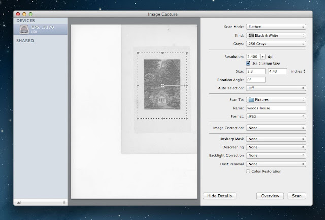
You'll want to scan in grayscale at highest DPI your computer can manage- preferably a bit higher then your final print resolution. Through trial and error, I eventually settled on 2,400 DPI for most images, but that's because I'm a maniac with a pile of external hard drives to store all my massive files. If you're reproducing your artwork at a 1:1 ratio, then can scan directly to your desired print resolution, but often the print size is going to be smaller than the actual artwork, and you can eek by with less. Make sure your scanner is set to jpeg, the scanner was designed primarily for photographers, and will default to the much larger TIFF file if I'm not paying attention.


As you can see, my scanned image came out much murkier than the original.

scan

photograph of original image

Now that you've scanned your images; I want you to stop, put down the stylus, and save yourself a new version of the file (I usually label them "scan" and "edit").

In fact, if you are in the midst of scanning the masterwork that took you 3 years to write and 8 years to draw, pause now and burn a bunch of CDs to mail to trusted friends (then repeat this process again with the final print files). Everyone has a hard drive horror story, and you'll be glad to have the extra backups if your hard drive expires after you've sold half of the original pages.

Now, open your duplicate copy in Photoshop, and make sure it's still in grayscale.


For this time I am  working entirely with levels, so hit command+L to bring up the adjustment panel, and start nudging the black and white arrows closer to each other. Start with very small adjustments, zooming in and out as you go.

Screenshots of the work in progress, click to enlarge
Keep an eye out for potential problem areas like fine lines, or dark areas with white highlights. You can zoom way in to see how some of the fine lines are doing.


At a certain point, those minor adjustments will become almost imperceptible on your screen, and at that point you can start getting more bold, and really move those sliders around.

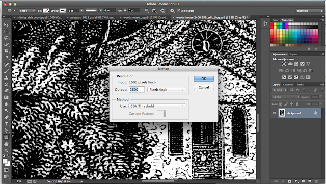
When you are happy with the result, SAVE it, and re-size the image to your desired print size and resolution by going to "Image" > "Image size". Here I decided on around 8"x11" at 1,600 DPI. Leave the "resample" drop down alone for now, we'll revisit that later.


Once your image is the appropriate size you can convert it to a bitmap. Go to "Image" > "Mode" > "Bitmap", and the output settings in the dialog box should already match the resolution of your jpeg. Not click on the "Method" dropdown menu and select "50% Threshold". Hit ok, SAVE your bitmap and you're done!
 

 click to enlarge the images below.


July 11, 2013

Website redesign, plus new URL!


We're back!

I've spent the last few weeks tinkering with the website- changing the color scheme, putting up a new header, and shifting the whole thing over to a new url: www.comic-tools.com.

Feed settings should stay the same, but please let me know if you have any issues!

I will be back later this morning with an introduction to scanning your artwork for print.