This week: Recommended animal anatomy video
You all should all already know about this week's topic, which I heard about on James Gurney's blog, because I've told you many a time about how great and useful James Gurney's blog is. I post things from it all the time, it's in the links sidebar, and any of you who aren't subscribed to it are fools shooting your artistic education in the foot.
So, being as you already read this post this morning when it popped up in your blog reader, I'll skip to saying that it intrigued me so much that I bought the video and found it to be worthwhile enough to recommend that you do the same.
Yes, I know, it's 39 bucks. Yes, that's a lot of money. Last year was the first year in three years I had to even file income taxes, having made an average of $8,000 a year after gross adjustment in those years, and this year I'm a clerk working for $9.75 an hour, so I don't wanna hear any clamouring about anyone else's budgetary constraints, especially not from anyone with a smartphone, or who buys coffee with any regularity. For 39 bucks you're getting more information than you'd get in three decent hour-long collage classes, from a very gifted professor, for way, way less money than you'd pay just for the lecture time, let alone the cost and time expense of putting together the graphics for the videos. These are worth the cash, if they suit your needs.
The videos do for basic animal anatomy what I endeavored to do for human anatomy in my anatomy posts (and will continue to do, several more coming at an undetermined time), but from someone much more expert and gifted than myself. His insights into simple but profound differences in quadruped and biped anatomy were revelations to me, in that way when you hear someone perfectly articulate a concept you've only barely understood by instinct. After watching these videos, I will look at animals and my approach to drawing them on a wholly different way.
I have a small issue with his basic shape exercises. I notice that he has a tendency, like many instructors, to assign beginner students different basic shapes for learning anatomy than they themselves use when drawing, which I feel hampers rather than enhances understanding of shape and ability to construct. However, he makes up for it by reversing the usually backasswards process I see in so many well regarded and in my opinion useless how to draw books by encouraging you to start with a gestural sketch, and use basic shapes to help you true the parts that seem off. Or, to use them as a separate intellectual exercise altogether. He's also very clear that you may use any basic shapes you like that help you understand your drawing better.
He's a gifted instructor, and it shows in his student's work, which is sprinkled all through the videos. You can tell he's taught them to really SEE differently. The music in the videos is ridiculous, but evidently it was composed by his son, so what can you do.
If you're someone who's ever had trouble drawing horses or realistic cats, which is everyone if we're not lying to ourselves, you really should invest in this tutorial.
Speaking of horses, I love these drawings from Fabio Moon showing the thumbnail drawing for a panel and the final artwork. This is what it means to take an adequate composition and push it into a good one.
Mark Kennedy posted this great analysis of how one out-of-place element in your art can throw your entire reality out of whack. Seriously, what was the artist thinking with those damned stars?
Finally, Kate Beaton did some great holiday comics. Yes, I know it's redundant to day she did some great anything.
See you next week!

December 28, 2011
December 21, 2011
This week: Your hand doesn't bend here.
 So, it came up several times this last week with several coworkers, who in my case are artists, that they didn't realize the bones in your hand don't bend in the location illustrated in the title. I can sort of see why someone might think it, so I'm just gonna toss this out there for people. In fact, your bones don't bend at either that line, nor the line seperating the palm from the fingers. The pad at the top of your palm actually comes both a little above and a little below your knuckles. Your knuckles are roughly in the middle of the pad, as you can see in the illustration:
 So when you bend your fingers down, the pad, which makes the bones in your palm appear longer than they are, gets bent down. This makes the palm seem to shorten and makes it look like the palm bones themselves must be bending. The phonomenon is easier to understand from the side:
 If you really want to prove it to yourself, fold your hand while looking at the back. You will see that the back does not change in length at all.
Knowing that the pad comes above and below the knuckles also helps you draw palm lines more accurately. I can't tell you how many students I've seen draw a hand with the top fold line in line with the knuckles, who then try to fit the lines of the palm onto a palm that's too small to fit them into. It's especially a problem for young artists who draw "realistically", meaning they hatch and shade too much and observe too little. It is a problem 100% of the time for those guys who seem to know how to draw every single gun known to man, in perspective, but can't draw a back three quarter view of a head or a garment that hangs naturally to save their lives. Those of you who have been to art school know the ones I mean.
Oh, and check out this recipe comic from Laura Park! Isn't she the best? That's a rhetorical question, obviously she is, duh.
See you next week!
December 14, 2011
This week: Assorted Tips
Cleaning out nifty links I've been saving:
If you don't read Brandon Graham's blog you should. He has fantastic taste and insightful comments about comics. I was particularly struck by this bit in one of his posts:
For some reason BPRD feels to me like watching a good tv series. It might be the episodic breakdown of the thing and the multiple writers. One thing I noticed is Guy Davis panels almost read like tv.

Chris Schweizer is always posting some awesome shit on his blog. Here's a fantastic (illustrated!) post on avoiding tangents of all sorts.
And here is a short but useful post on how clothes drape from the always educational Gurney Journey blog.
Illustrator, cartoonist, and teacher Jillian Tamaki made a student FAQ page for her website. It's great! Go read it!
After Completing Habibi, Craig Thompson is now working on three books at once. That all ages one looks absolutely delicious.
And finally, Kate Beaton's Hark, a Vagrant! collection made it into Time's best 10 books of the year!
Have a good week all!
Cleaning out nifty links I've been saving:
If you don't read Brandon Graham's blog you should. He has fantastic taste and insightful comments about comics. I was particularly struck by this bit in one of his posts:
For some reason BPRD feels to me like watching a good tv series. It might be the episodic breakdown of the thing and the multiple writers. One thing I noticed is Guy Davis panels almost read like tv.
(click image to make it bigger)
"I thought this scene where this old woman is talking through a child was done how you would see it on tv. --with the woman starting to say the words and the little girl finishing them--seperate panels seperate baloons. I photoshoped, on the right what i'd look like if both characters spoke through the same baloon, with 2 tails.

I like how a small tweak like that can effect how it reads.
I think the original lettering does make the old woman and the girl seem farther away."
Chris Schweizer is always posting some awesome shit on his blog. Here's a fantastic (illustrated!) post on avoiding tangents of all sorts.
And here is a short but useful post on how clothes drape from the always educational Gurney Journey blog.
Illustrator, cartoonist, and teacher Jillian Tamaki made a student FAQ page for her website. It's great! Go read it!
After Completing Habibi, Craig Thompson is now working on three books at once. That all ages one looks absolutely delicious.
And finally, Kate Beaton's Hark, a Vagrant! collection made it into Time's best 10 books of the year!
Have a good week all!
December 7, 2011
Potpourri
No specific topic this week, but rather a smattering of fascinating things. I'm gonna kick it off Elanor Davis and the interesting method she used to generate this image:
 Elanor uses guache to make color paintings a lot, so I thought nothing of seeing a two-tone drawing from her, until I saw a series of tweets from her, which she meant to send to meg Hunt, but mistakenly posted to all, saying that she'd actually just altered an ink wash drawing to make this and other illustrations. I was fascinated, and asked if she'd elaborate, which of course she did:
Next up is a review of a device I hadn't even heard about until this review, the Wacom Inkling:
It sounds neat, but I was disappointed to see that the scanner gets less accurate the farther away from it you get, so you have to use a fairly small drawing area. So, no good for full-size pages, but maybe good for scaled down thumbnails. I'd probably just get a pad myself, but Crabfu makes the point that this now gives him original art to sell while simultaneously creating a layered, colorable digital file. Original art sells for more than prints, and that means more income, so it's not a trivial consideration. The alterations you can make to the line quality after the fact is pretty interesting too.
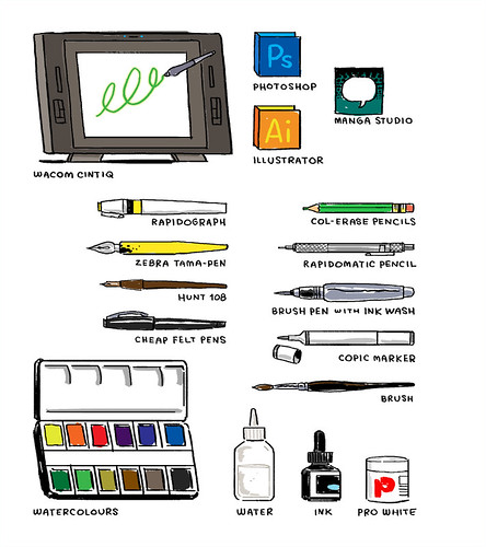
John Martz did a drawing of all the stuff he used to draw, for the artist's space porn tumblr Where They Draw. I don't know just why, but I LOVE seeing people's studio setups.
Alec Longstreth finally finished the final chapter of Basewood! As some of you may know, Alec resolved not to shave or cut his hair until this task was completed. Well, here's what he looks like now:
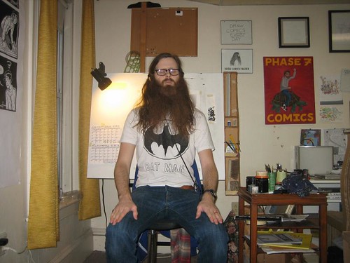
As you can see in his post about it, he'll be cutting his hair at the release party. Alec has been a friend of mine as well as Comic Tools blog, and is himself a great comics teacher, so I'd have posted about this no matter what, But as it happens, Alec gave me a flimsy premise to call this a tool related post with this comment to his post:
See you next week!
No specific topic this week, but rather a smattering of fascinating things. I'm gonna kick it off Elanor Davis and the interesting method she used to generate this image:
 Elanor uses guache to make color paintings a lot, so I thought nothing of seeing a two-tone drawing from her, until I saw a series of tweets from her, which she meant to send to meg Hunt, but mistakenly posted to all, saying that she'd actually just altered an ink wash drawing to make this and other illustrations. I was fascinated, and asked if she'd elaborate, which of course she did:
Hey Matt!Isn't she great? Feel free to thank her by buying all her work.Ha! you caught those tweets - I meant them to be @meg and mis-sent them, then threw my hands up at the whole thing. : )Yep, that's a greyscale piece I messed w/ in photoshop. I don't have a good method for going about this process, there surely is an easier way to do it. I basically just do it for limited color printing processes; I don't think I would do it for any other reason, it's a hassle! : pMake two separate files. Keep one greyscale.for the other one: Image > mode >duotonechoose monotone; choose red (or whatever)Now turn it into CMYK. Copy paste the greyscale file on top of the red version. They should line up perfectly. Then erase whatever parts of the grey layer you want to be red.You can also monotone both w/ different colors. This image is 2 colors, for a process where the 2 colors combine into a 3rd. Just make the top layer transparent.
Finally, select the erased sections of the grey layer, inverse the selection, and delete that part from the red layer.Thanks for asking! I hope you're doing great! : )Eleanor
Next up is a review of a device I hadn't even heard about until this review, the Wacom Inkling:
It sounds neat, but I was disappointed to see that the scanner gets less accurate the farther away from it you get, so you have to use a fairly small drawing area. So, no good for full-size pages, but maybe good for scaled down thumbnails. I'd probably just get a pad myself, but Crabfu makes the point that this now gives him original art to sell while simultaneously creating a layered, colorable digital file. Original art sells for more than prints, and that means more income, so it's not a trivial consideration. The alterations you can make to the line quality after the fact is pretty interesting too.
John Martz did a drawing of all the stuff he used to draw, for the artist's space porn tumblr Where They Draw. I don't know just why, but I LOVE seeing people's studio setups.
Alec Longstreth finally finished the final chapter of Basewood! As some of you may know, Alec resolved not to shave or cut his hair until this task was completed. Well, here's what he looks like now:
As you can see in his post about it, he'll be cutting his hair at the release party. Alec has been a friend of mine as well as Comic Tools blog, and is himself a great comics teacher, so I'd have posted about this no matter what, But as it happens, Alec gave me a flimsy premise to call this a tool related post with this comment to his post:
Yes, I will be donating my hair. That would be funny to make a brush from the beard hair - maybe it would have magical comics power in it! :PFinally, nd totally unjustifiably, mega-super friend of Comic Tools Blog Hope Larson is making crazy-ass ice creams and posting photos of them: Ice Cream Log
See you next week!
Subscribe to:
Posts (Atom)