Sean Michael Robinson at The Comics Journal did an exhaustive interview with Gerhard, Dave Sim's background artist on Cerebus. It's a must read for every cartoonist who cares about technique, as the Robinson asks Gerhard about specific pages throughout the comic's decades-long run, with Gerhard talking about everything from his preference to toothbrushes over airbrushes for snow effects to showing photos of the models he built ho help him draw rows of houses on slanted streets.
Gerhard with his models.
Gerhard is one of the best draftsman in the last 50 years of comics, and this interview is one of the richest resources I've ever had a chance to bring to your attention. Read, and watch as a man grows from a talented amateur into a true virtuoso, sharing his secrets with us.
My internet's been spotty all night, and now it's late, so I'm going to bed and writing this thing Tuesday night. (Monday is Valentine's dinner with the lady.)
This week on Comic Tools: Futzing with nibs
I'm insomniac tonight, so I'll type this sucker up now:
"Hey Matt. So possibly right under your feet all day at work are these scroll nibs, which are usually used for making filials and jazz for fancy calligraphy. Also, at the very bottom, is a thing called a music nib, used for making musical notation lines, it is made by Brause, not Mitchell, so it won't be in the kit. I got mine from scribblers in the UK after seeing them in someone else's catalogue, and I assumed they must be hackable for cartooning short cuts. Double vision, quicker hatching for bgs that must be covered in them, plaid shirts, checkerboards... the list is not gigantic, but you can get some interesting results. I'm not entirely certain that they are in NY Central, but I believe I saw mitchell caligraphy kits hanging over the doorway to the little room the G nibs are stored in, so if you see them, you could probably come up with some ingenious use for them that I am missing. I've used them for a bit of grass in the new comic already, and it was delightful to use something a little different."
She included this photo:
Indeed we do have these nibs downstairs at New York Central. If you walk straight into the store about halfway, you'll see these cheesy looking beige cardboard bubble packets sitting way up high where the managers sit:
You'll have to ask for someone to help you reach them, unless you're seven feet tall. These are what the packets look like up close, and what they cost:
New York Central got the whole lot of them in a buyout of another closing supplier, so once these are gone, they're gone. Fortunately, for anyone who might want them, they don't seem to sell well. Anyhow I've got them back at home now, and I've been playing around with them. I've narrowed it down to 8 that produce various effects I like, and I've been futzing around with them, like MK did.
My first impressions are that either these types of nib are either all made of unusually crappy and thin steel, or that the tinyness of the individual nibs having to share the space makes them weak, much like too many babies sharing a womb, or that this particular brand may just be crappy. I don't know, but nonetheless I've found some uses for these that might induce me to buy more anyway.
The nibs with evenly spaced, equal-sized points make hatching large areas really, really easy and SOOOOOOO much faster. They also make great speed lines.
The evenly spaced nibs with one point larger than the other make pleasantly dynamic and perfectly spaced pipes, dowels, poles, and rope. If I wanted to to an entire series of knot-tying illustrations, one of these nibs would very possibly save me from insanity.
The nibs with multiple slits cut going to the same point hold extra ink like a lettering nib while remaining flexible like a quill, and so far the best use I've found for these are really fantastic willowy tree limbs that you can draw with the line variation of a brush, but with a line quality that is unmistakably of a nib.
Anyhow, I'm gonna mess around with these some more and then do a proper post on them.
Finally a link: A fantastic interview with Mike Mignola about setting and architecture. One lesson learned: you neither need to like drawing, nor even actually draw, straight lines or perfect perspective in order to draw houses, cities, and other settings in a convincing and lively way. Slanty lines and age are your friends.
See you next week!
February 6, 2011
This week on Comic Tools: Eraser Showdown 2!
As I've mentioned before, I currently work at New York Central Art Supply in the paper department. Downstairs on the side of the checkout counter alongside all the other impulse buys, they have a bunch of little bins with erasers in them. There were three I'd never seen before, so I decided to buy them and test them out against the current champion, the Tombo Mono eraser.
The new contenders are:
Pentel Hi-Polymer
Faber-Castell "Dust free"
MOO eraser
Unlike in the last test, all of these erasers erased a well dug-in line cleanly and completely. None of these products fails in role as an eraser. That leaves us with the next characteristic, amount and size of dust. This is how each of them fared with each eraser brand-new, using the corner to erase the line:
It seemed like a pretty clear-cut win for the Tombo, with the MOO a close second. My next test was to see how they affected ink, whether they'd lift your drawings off the page. Some erasers can be so aggressive that they remove not only pencil but ink and paper fibers, like an art-destroying tornado. All of these performed roughly the same in that test, but as I used them to erase over the ink with their now ground-down corners, I found that the two really dusty erasers were now producing snakes, as they should. I made new pencil lines and tried again, with these results:
The scale of these photographs is slightly out of whack, as the Tombo's snake of dust was actually smaller than the Faber-Castell's. Nonetheless, with a blunted corner all of them performed adequately, and certainly better than the losers in my previous test. Now a new problem revealed itself, namely that certain erasers were using themselves up far more quickly for the same amount of erasing. The MOO, in particular, crated a hilariously long and thick snake of eraser waste, enough that an earthworm might have tried to mate with it were it any larger. The Tombo won again, with the MOO second in creating less dust, but the Faber-Castell coming in second in not using itself up too quickly. They all erased adequately, and I'd recommend any of them.
Extreme Perspective! For Artists: Learn the Secrets of Curvilinear, Cylindrical, Fisheye, Isometric, and Other Amazing Systems that Will Make Your Drawings Pop Off the Page (Book & DVD)
In this sequel to the classic bestseller Perspective! For the Comic Book Artist, David Chelsea takes perspective to a whole other level—by exploring the most dramatic viewpoints employed by today’s artists. Many of these techniques have been carefully guarded secrets for centuries. But David, and his hollow-headed friend, Mugg, make them accessible to a new generation of artists, cartoonists, illustrators, and animators. In Extreme Perspective! For Artists, you’ll learn how to
• Render complicated multi-sided objects in perfect perspective • Create accurate shadows and reflections from your own imagination • Master the most difficult kinds of curvilinear perspective systems • Draw eye-popping images in fisheye perspective • Use your computer to create elaborate scenes quicker and more easily • … And much, much more!
Also included is a comprehensive library of perspective grids on DVD, suitable for printing or using with Photoshop and other applications.
All that for $13.35? WHY DO I NOT HAVE IT IN MY HANDS RIGHT NOW? WHY DON'T YOU?!
January 23, 2011
This week on Comic Tools: Reader Question
Hey Matt,
I've recently read the Scott Pilgrim comics and become interested in drawing comics. I've always been a hopeless drawer though so i got a book to teach me some basics and it's really helping so far, but it doesn't teach anything about comics. I found your blog very useful but its hard to find somewhere to begin. Are there any books out there you'd recommend to teach basic comic drawing?
Read those and do all the assignments suggested in them, and you'll have just saved yourself 4 years of college. I wish I were more than a hair away from kidding.
Long answer:
To get good at comics you'll have to read a lot of comics, and learn to steal. I don't mean imitate- that's like stealing someone's jewelry by hoisting their house into the back of your pickup and driving off. It doesn't work and you look like a moron doing it. You must learn to steal- and I use that word deliberately- the very best parts of what works about your favorite artists, and throw away the rest. You must learn to avoid taking on the bad habits of artists you like, the way you might avoid contracting AIDS. It's so easy, SO easy, to look at a great artist, imitate (meaning copy totally) their art, including it's weak parts, and then defend those weaknesses for decades as the inspiration you got from a great artist, instead of a cheap, hacky trick that both you and the artist you got it from should be shamed of. Jack Kirby was insanely inventive and kinetic and used blacks like no human being before or since, but he basically drew humans with 2 not very good faces and just slightly more expressions. Dave Sim has an incredible work ethic and is a proficient inker and letterer, but his people are ugly, stiff, and insensitive. Moebius and Frank Quitely are some of the best draughtsmen on the planet, but they draw distracting and freakish baby faces on everyone and sometimes their art can be lifelessly static.
Everyone's style is a combination of all the things they're best at, and attempts to either avoid or cover the evidence of everything they suck at. Mike Mignola once confessed to a class I was in that he doesn't draw cars because he hates drawing them and uses lots of shadows because he sucks at perspective. You'll eventually form your style by lazily covering up all the things you suck at; don't add to that all the things your favorite artists suck at.
This counts ten thousand times more if your art is Manga influenced. Every single one of my manga influenced artist friends will back me on this: if you take your cues by imitating your favorite manga, you will spend years of your commercially crippled career painfully stripping your art of the shortcuts that, by sheer necessity of how fast those artists must produce, makes up 1/2 to fully 9/10ths of the art of any given page of manga.
If you ever find yourself thinking "Oh, finally, this art looks like something I can actually draw!", put the book down and never look at it again. If bikes are hard for you, fill a sketchbook with people on every kind of bike you can find reference for. If hands are really tricky for you, never, ever draw a panel without showing both hands of every person in the panel. If shoes are tricky for you, don't do another damned thing until you can draw everything from sneakers to dress shoes convincingly. Learn to draw brick walls that don't look like cinderblock walls. Read a lot of good comics, look at a lot of good art, read a lot of good books, and learn to steal the very best from all of them. And don't imitate.
For young or beginning artists who want a warm, earnest, supportive place to get input on their work, there's few places better than the Flight Forums. Professionals from the books and others who just hang out are always watching to give advice to all those who seek it.
Why has Alec Longstreth given up on rapidographs and pigma pens? Find out!
Remember how I was talking about absorbing the worst shortcuts from people's work? Here's a great example. Ha, "Dreamworks brow."
Next week, another eraser showdown!
January 16, 2011
The biggest event in Comic Tools likely to happen this year or any other happened last Sunday, with Jim Woodring exhibiting his enormous pen, it's dripping tip gleaming in the light, to over 100 assembled men, women, and children. Woodring found the 25 pound black wooden shaft awkward and difficult to maneuver, and eventually resorted to just working with the tip, which produced much happier results.
Okay, enough dick innuendo. (Heh, in YOU end-o.) Seriously though, you have no idea how much I wanted to photoshop truck balls onto this thing. Or make a super-nerdy comics in-joke by having the tip going through a slice of pizza.
Dick jokes aside, I really, really love that this thing exists. It's actually really fascinating to me that his learning to use this thing wasn't all that different than the process I go through picking up any ordinary pen.
He had two nibs made, a steel prototype, and then a brass-plated, hand-engraved model, seen here:
Beautiful, right? But it turned out that that nib was actually a bit too stiff, and the steel nib was more flexible, so Jim put the better looking nib away in favor of the more practical prototype:
(The brass nib in the bucket of shame. click on this image for Glenn Fleichmann's great flickr set of this event.)
This happens to me all the time, when one nib will just be too damned stiff, and I have to chuck it and move on to another one in the box.
Here you can see Jim making the first lines with the stiffer brass nib, and all the dripping and control problems he was having:
At first he was cautiously getting a feel for what marks it could and could not make, and the frist drawing was pretty shabby looking, which always happens to me while learning a new tool.
But amazingly, not too far into the demonstration, Woodring's inking with the pen from Land of the Giants was virtually indistinguishable from his regular inking. Here he is inking a drawing with the Nibbus Maximus:
And at the end of this video you can see him inking with his regular pen:
The man clearly has a feel for the nib as a broad concept, and when you change the parameters, like size, ink thickness, and flexibility, he just has to take awhile to readjust his technique before he's mastered it as he would any other nib. It's way, way more interesting to watch than I thought it would be, and watching him have to struggle to adapt to the tool gave me insights into how any artist adapts to nib pens.
Many have pointed out that new Seattle transplant Scott Kurtz was at the event (as seen in the below photo), and I thought I'd take this opportunity to say what spectacular resources the podcast Webcomics Weekly (which he co-hosts) and accompanying book How to Make Webcomics (which he co-wrote) are. My good friend Erika Moen helped make herself a successful independent artist and businesswoman based on concepts she learned from these resources, and anyone who has a webcomic, are is looking to start a webcomic, would do well to buy the book and start listening to the podcast from episode 1.
Two additional things Woodring posted on his blog that I thought were cool, a guide to how nibs were made in the old days:
(Click to see larger.)
And this drawing of a frog being hit by lightning:
(Click to see larger.)
I notice that Wooding is wearing the exact same shirt and suit that he was wearing when I met him at an art opening, and I wonder if he's like me, with only one nice outfit that he just uses over and over at any vaguely fancy event.
In unrelated news, Dark Horse posted this really fantastic back and forth illustrated dialogue between editor Scott Allie and artist Guy Davis on the latest BPRD cover. It's a perfect example of an editor doing their job right, taking an okay idea and molding it into a great one, making the artist look good, and strengthening the narrative impact of the imagery.
Below, a special treat for you: A progression from Guy's thumbnails, to his pencils, to his inks from one of my favorite pages in that issue. Click to see it in all it's glory:
See you next week!
January 8, 2011
This week on Comic Tools: Take care of your wrist!
Robin Bougie is one of the nicest men I have ever met in comics. Much like the also famously sweet Scott McCloud, he's spends most of his time as a creator helping other creators, publishing their work, using his own prominence to bring good work to light, and talking openly about his experiences as a creator. For years now he's had problems with his drawing hand, as has his wife Rebecca. This is the second time he's posted this video of injury-preventing hand stretches:
When he first posted it I was drawing a lot of comics myself, and getting terrible wrist pain. These stretches helped me a lot. From his post:
Do these stretches before you start, and once an hour, every hour, while drawing. Please don't fuck your shit up like we did. If you're a writer and typing a lot, it couldn't hurt you to do the same.
Think of yourself like an athlete, and for them stretching before they take part in their sport is absolutely VITAL in order to prevent injury. We, as artists, absolutely have to start thinking this way as well -- especially if we're in our thirties or older when our bodies aren't willing to put up with the crap we put them through.
I'm having a lot more trouble staying pain free because I started doing these stretches stuff AFTER I strained my arm, and I know now that it's much better to be preventative and begin doing them before you do permanent damage. LEARN FROM MY MISTAKE!
Your wrist is no less a comic tool than your pen, unless you intend to learn to draw somehow without it. Take care of it. Don't hold El Corazon over crocodile-filled water with your wrist.
By the way, unless you have a really high tolerance for fucked-up, disturbing sexual imagery, do NOT click to see the other entries in his journal. Don't say you weren't warned.
Oh, and I really liked this comment to the youtube video:
"This has helped me quite a bit. For those that loose faith in humanity...visit Youtube every now and again. The fact that people take time out of their lives to help people like this is a testament to humanity"
I actually mainly watch youtube videos by people who have taken time and effort to teach others, but it's still odd to me to see someone associate youtube with MORE faith in humanity. Probably because any video, of any thing, will eventually get a comment calling the poster a fag or questioning their skills. This comment made me think that maybe I should focus more on the fact that I've gotten an amazingly thorough education on a few subjects on Youtube, and less on guys in their parent's basement looking for things to call faggy while their tiny penises heal from over masturbating.
Also, in perhaps the biggest Comic Tool news of all time, Jim Woodring will be demonstrating his enormous, 7 foot nib pen. Here's video of the nib:
He's using it in public for the very first time today, and I'll post video of that when it becomes available. I have no idea how the hell this thing is supposed to work, but you can bet I'm drooling to find out and see what he can do with it.
See you all next week!
January 2, 2011
Reader Question:
Hi, I'm following your comics tools blog lately and I want to know if there is a post on Paper/Bristol Board. I want to buy bristol board at Blue Line Pro but I'm not sure if I should take 2ply or 3ply. It's a 10$ difference. I'm from germany and we don't distinguish by ply we only do by weight.
Could you give me advice?
Thank you so far
Jannick
Bristol is a fast-dying form of commercial grade paper that is still used by many cartoonists and illustrators, although not nearly as much as it used to be, the result of which has been a steep and ever worsening decline in variety and quality, as it's no longer profitable for mills to manufacture for anything less than astronomical prices.
Bristol is made by laminating thin sheets together with glue, creating thicker sheets, as opposed to producing a thicker sheet from the get-go. This is what the ply of bristol refers to; 1 ply is a single sheet thickness, 2 ply is two sheets glued together, and so on.
I see no particular reason to get more than 2 ply bristol. Because of the gluing process, thicker bristol isn't less prone to buckling than thicker bristol, unlike with other kinds of paper, although is is more resistant to denting. Which would matter if you were using your art as a car door. In my experience all it does is add weight to your portfolio.
Thisweek on Comic Tools: Preparation Links
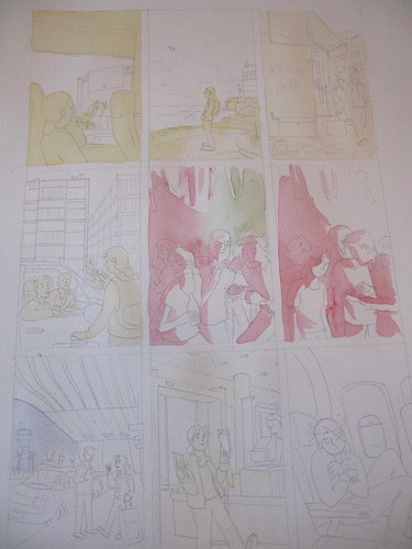
Sarah Glidden shows us how she made her wonderful watercolor comic pages. Of particular interest to me was her use of a glaze of color under SOME, but not ALL parts of the images. I've seen cartoonists like Lucy Knisley use washes of color, usually yellow, over the whole image, but the way Sarah uses it is interesting, because she uses it to compartmentalize different parts of the ground from each other.
On this example page, she uses a yellow wash to separate the foreground from the midground and background, and blue to make a background sink deeper into shadow. You can't always see these glazes of undercolor in the final panels, yet this subtle technique makes her painted panels organized and easier to read.
Friend of Comic Tools, Jason Little, wrote this fantastic post about his artwork and writing process leading up to his fantastic latest book from Dark Horse, Motel Art Improvement Service. There's so much to love about this post, like his accounting about how the story started as a misguided diatribe about the health insurance industry, or how he originally wanted to serialize the story in a series of regular comic books. He was talked out of both ideas, and the result is better for it. It's the comics equivalent of a wife saying to her husband, "You're not going out looking like THAT, are you?!"
I must say though, I love this panel from when he was contemplating doing the book in only two colors of ink to save printing costs. It shows what a master of print Jason is, that if you don't have an eye that looks for such things, you don't immediately notice this panel has only two colors. It looks so lush.
Aaron Renier talks about his process writing and drawing Walker Bean in this Newsarama interview. I have seen art from this book, and it makes me shake with jealousy just thinking about it, it's so good.
Friend of Comic Tools Chris Schweizer posts artwork frequently to his blog, and it reveals that he one one of the ballsiest inkers and loosest pencillers I have ever seen in my life. Seriously, his pencils are often less resolved that a game of connect the dots. I don't know how he does it. Here, he posts one of his most detailed penciled panels (still absurdly under rendered), and here he shows off some gorgeous setting sketches for a story. The amazing thing is, that panel isn't even his finished inks- for his comics,he renders what look like finished inks in marker, then scans them in, prints them in blue, and inks in brush over that. But I've seen him ink drawings straight from pencils that loose that looked no less finished, to my eye. Insane.
Here we have a great example of everything I stand against in art teaching, in this excerpt from How to Draw Comics the Marvel Way:
See how easy it is? Just draw a stick figure, then add cylinders, then fill it in with years of painstaking anatomical study and direct life drawing knowledge, not to mention expert knowledge of lighting, drapery, and character design. Jesus Christ, why don't they just show you a white sheet of paper and say "Just add characters here with a pencil! Pause the tape while you practice doing that."
My thanks to my good friend Emily Felger for sending me a new keyboard.
December 19, 2010
Thisweek on Comic Tools: Eraser Shields
In the course of penciling comics, sometimes you end up with little distracting lines that you want to get rid of, but they're so close to lines you want to keep that erasing one might accidentally erase the other. It's a common problem when drawing fiddly, intricate things like faces, or as I've chosen for this example, skulls.
My usual solution to this problem is to form a point on my kneaded rubber eraser and use it to erase only the lines I want gone. If you do this, make sure your point isn't long and floppy like this, or you won't be able to press on it hard enough to erase.
Make the angle of the tip as obtuse as you can, and the tip will hold up to much harder erasing before losing its shape.
However some artists, like my girlfriend, press their pencil into the paper like a marine trying to stab through body armor, and kneaded rubber erasers aren't enough. Here's her eraser, worn to a blunted nubble:
How is she to erase single lines with this, without erasing everything around them? That is where eraser shields come in. An eraser shield is just a paper-thin piece of steel slightly larger than a credit card, with holes of various shapes and sizes cut in it. You cunningly select and position the holes to mask off the lines you want gone, like so,
And then erase them.
You have to be careful about checking your placement, though,
lest you remove lines you in fact want to keep:
They really ought to make these in clear flexible plastic for better positioning. It wouldn't be too difficult to make one out of acetate, though. Any material that was thin and stiff enough would work.
Anyway, here's the cleaned pencils,
And heres the skull all inked up:
Sorry I haven't been getting to comments yet, my keyboard is broken and my spacebar has been dead all week. I've been inserting every space by copying and pasting, writing this. I have a friend with a new one, though, so hopefully that'll be sorted out soon.