
Sarah Glidden shows us how she made her wonderful watercolor comic pages. Of particular interest to me was her use of a glaze of color under SOME, but not ALL parts of the images. I've seen cartoonists like Lucy Knisley use washes of color, usually yellow, over the whole image, but the way Sarah uses it is interesting, because she uses it to compartmentalize different parts of the ground from each other.
 On this example page, she uses a yellow wash to separate the foreground from the midground and background, and blue to make a background sink deeper into shadow. You can't always see these glazes of undercolor in the final panels, yet this subtle technique makes her painted panels organized and easier to read.
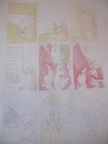
Friend of Comic Tools, Jason Little, wrote this fantastic post about his artwork and writing process leading up to his fantastic latest book from Dark Horse, Motel Art Improvement Service. There's so much to love about this post, like his accounting about how the story started as a misguided diatribe about the health insurance industry, or how he originally wanted to serialize the story in a series of regular comic books. He was talked out of both ideas, and the result is better for it. It's the comics equivalent of a wife saying to her husband, "You're not going out looking like THAT, are you?!"
I must say though, I love this panel from when he was contemplating doing the book in only two colors of ink to save printing costs. It shows what a master of print Jason is, that if you don't have an eye that looks for such things, you don't immediately notice this panel has only two colors. It looks so lush.

Aaron Renier talks about his process writing and drawing Walker Bean in this Newsarama interview. I have seen art from this book, and it makes me shake with jealousy just thinking about it, it's so good.
Friend of Comic Tools Chris Schweizer posts artwork frequently to his blog, and it reveals that he one one of the ballsiest inkers and loosest pencillers I have ever seen in my life. Seriously, his pencils are often less resolved that a game of connect the dots. I don't know how he does it. Here, he posts one of his most detailed penciled panels (still absurdly under rendered), and here he shows off some gorgeous setting sketches for a story. The amazing thing is, that panel isn't even his finished inks- for his comics,he renders what look like finished inks in marker, then scans them in, prints them in blue, and inks in brush over that. But I've seen him ink drawings straight from pencils that loose that looked no less finished, to my eye. Insane.
Here we have a great example of everything I stand against in art teaching, in this excerpt from How to Draw Comics the Marvel Way:
See how easy it is? Just draw a stick figure, then add cylinders, then fill it in with years of painstaking anatomical study and direct life drawing knowledge, not to mention expert knowledge of lighting, drapery, and character design. Jesus Christ, why don't they just show you a white sheet of paper and say "Just add characters here with a pencil! Pause the tape while you practice doing that."
My thanks to my good friend Emily Felger for sending me a new keyboard.
4 comments:
Ben Edlund did it best:
http://bit.ly/drawthetick
Yes. Yes he did.
Ha! Brilliant link ^
I don't know, for some reason I still find the marvel method helpful. It certainly has enormous gaps in it as stated, but it does at least get one thinking about how to sculpt a shape on paper.
It's weird how back in the day, all the major comic artists were these husky, silver bearded men with slick hair and big tinted glasses. It's like they're all old mafia bosses lounging around drinking cocktails and smoking cigars.
Watching that video has taught me everything i needed to know, i am throwing away my prior knowledge from drawing from life and instead will draw the marvel way :)
Post a Comment