Take it slow baby, but don't stop
My favorite thing in recent years, in terms of the information available to someone trying to learn the craft of making comics, is creators posting videos showing themselves inking. It seems to be kind of a thing now, and my hope is that it's a meme that keeps spreading. When I look at a drawing by an artist with a very distinctive line, I always try to reverse-engineer it. What sort of tool did they use? How did they make those marks with it? How did they hold the tool? What did their hand-movements look like?
Through years of experimentation and research I've been able to either learn how the artists make their marks, or at least learned how to produce a reasonable facsimile. Seeing original art has helped a lot, and made me a more confident artist, by seeing how much white out people like Chris Ware and Charles Burns have to use to make their images look like they do. But nothing has been so useful to me as seeing footage of artists actually inking. The videos everyone has probably seen already are videos of Jeff Smith inking, like this one:
These are pretty cool, and certainly illuminate his working process in a way that I find wonderfully transparent and helpful, but what bugs me is all his videos are time-lapsed. It's great for showing every step he takes in a single drawing, but what we miss is the biggest thing I've learned from watching footage of cartoonists inking: SLOW DOWN, BUT DON'T STOP.
In the past, when I looked at art by people like Paul Pope or Becky Cloonan or Fabio Moon, who all have explosive, kinetic lines that seem to have been laid down by a speeding spaceship, I assumed that those marks were made quickly and violently, because they looked quick and violent. But I was totally stymied in my attempts to recreate such effects, because although I could make marks that looked liek theirs by being violent and swift with my brush, I couldn't control my line, and I didn't have enough time to make all the little decisions I needed to be making.
I've since had the pleasure of seeing all of these artists ink, either on film or in person, and what I learned is that that speed and violence is an illusion created by careful planning and great craft, and by moving slowly but steadily through the page, like an explosion happening in slow motion. Think of high-speed camera footage of an apple being shot with a gun. The explosions takes shape with a slow, deliberate pace, but the result is striking, and the still images suggest great speed and power.
The next time I sat down to ink a fight scene with lots of motion blurs, as I drew I made the sound of an explosion in slow motion. Instead of "P-KooM!" I went "Pppppppkkkkkkkkkkkkkkkkkkkkkkkkooooooooooooooooooooo...", dragging the sound out into a modulating but sustained growling noise. I literally made the sound out loud, albeit quietly, for a good hour straight. It was the best page of motion lines I ever made. They look like they were laid down by twenty dozen hells-angels nibs all peeling off and leaving slashes of wet ink, but in fact they were all drawn with a steady, careful hand, and a mind thinking in slow motion.
Watch these two videos of Fabio Moon and Gabriel Bá inking. Watch how both men move from one task to the next steadily, slowly enough to give each line the consideration it deserves, but no longer. I hope you find them as helpful as I've found them.
(in this first one, look how at around 2:50 Fabio carefully allows just a touch of white space to separate his character's hair from his eyebrow. Just one of thousands of little decisions that make up a good page of inking.)

November 12, 2008

November 11, 2008
November 9, 2008
The amazing Trade Loeffler
posted this comment:
posted this comment:
"Hey Matt,
A couple of great posts so far. Your mirror trick is something I'd never been taught, but learned on the fly when I started drawing my Upside-Down Me story. When flipping the characters from the floor to the ceiling and ceiling to floor I started catching all kinds of flaws in my drawings, and realized what a great technique it was to look at my drawings from different perspectives.
I don't have a mirror that I work with (not enough room in our NY apartment), but I use my lightbox instead. Flipping the drawing over and examining it from the back works just great for me."
Trade's online comic Zip and Lil' Bit, which finished it's second story arc in June, is one of the best drawn web comics today. His comment shows exactly why I'm doing what I'm doing with this blog. I know so many cartoonists who are growing into their craft, who don't lack for talent, but who struggle with easily fixable problems because they simply haven't heard these little bits of knowledge that would make their creative lives so much easier. Most cartoonists are left to figure these problems out on their own, and sometimes they never do. How-to books are usually focused on broad problems like figure drawing and making pages that read clearly, and they rarely contain all these hard-won little pieces of accumulated craft. These things become second nature to a professional, to the point where I think people take for granted just how hard and slow drawing was for them before they learned them all.
The internet has really made things better. Trade frequently posts work-in-progress pictures with explanations of his process, as do many cartoonists these days. It's common for young artists to post their pencils and even thumbnails up on Flickr for people to see how they work, and there's an entire Flickr Group dedicated just to cartoonist's work spaces. A recent and WONDERFUL phenomenon has been artists posting video of themselves working. All of this is for the same common goal- we remember how hard it was for us to get this information, and we all want it to be as easily available as possible. If you want to know, you should be able to find it out. What I'm trying to cover with this blog is the stuff you didn't know you wanted to know, things you wouldn't necessarily know to seek out on your own.
Warren Ellis once posted an idea he had where blogs and social networking would basically evolve into mass, simulcast radiotelepathy, where every piece of new knowledge would be instantly broadcast to the entire group, so that everyone's knowledge would increase at once. I dream of an artistic world like that, where your limits are the limits of your creativity, not your knowledge.
 Old artists sometimes see knowledge as something to be hoarded and guarded. They see themselves as riding in a helium baloon, and if they give away their helium to other balloonists they'll sink as the other baloonists rise. Of course, the truth is that they're riding in a hot air balloon, and if everyone shared their fire with each other, they'd all rise up faster and higher than they could if they were miserly with their flame.
I hope that my readers will tell me, whether by radiotelepathy or comments or email, about any tips and tricks they've learned.
A couple of great posts so far. Your mirror trick is something I'd never been taught, but learned on the fly when I started drawing my Upside-Down Me story. When flipping the characters from the floor to the ceiling and ceiling to floor I started catching all kinds of flaws in my drawings, and realized what a great technique it was to look at my drawings from different perspectives.
I don't have a mirror that I work with (not enough room in our NY apartment), but I use my lightbox instead. Flipping the drawing over and examining it from the back works just great for me."
Trade's online comic Zip and Lil' Bit, which finished it's second story arc in June, is one of the best drawn web comics today. His comment shows exactly why I'm doing what I'm doing with this blog. I know so many cartoonists who are growing into their craft, who don't lack for talent, but who struggle with easily fixable problems because they simply haven't heard these little bits of knowledge that would make their creative lives so much easier. Most cartoonists are left to figure these problems out on their own, and sometimes they never do. How-to books are usually focused on broad problems like figure drawing and making pages that read clearly, and they rarely contain all these hard-won little pieces of accumulated craft. These things become second nature to a professional, to the point where I think people take for granted just how hard and slow drawing was for them before they learned them all.
The internet has really made things better. Trade frequently posts work-in-progress pictures with explanations of his process, as do many cartoonists these days. It's common for young artists to post their pencils and even thumbnails up on Flickr for people to see how they work, and there's an entire Flickr Group dedicated just to cartoonist's work spaces. A recent and WONDERFUL phenomenon has been artists posting video of themselves working. All of this is for the same common goal- we remember how hard it was for us to get this information, and we all want it to be as easily available as possible. If you want to know, you should be able to find it out. What I'm trying to cover with this blog is the stuff you didn't know you wanted to know, things you wouldn't necessarily know to seek out on your own.
Warren Ellis once posted an idea he had where blogs and social networking would basically evolve into mass, simulcast radiotelepathy, where every piece of new knowledge would be instantly broadcast to the entire group, so that everyone's knowledge would increase at once. I dream of an artistic world like that, where your limits are the limits of your creativity, not your knowledge.
Old artists sometimes see knowledge as something to be hoarded and guarded. They see themselves as riding in a helium baloon, and if they give away their helium to other balloonists they'll sink as the other baloonists rise. Of course, the truth is that they're riding in a hot air balloon, and if everyone shared their fire with each other, they'd all rise up faster and higher than they could if they were miserly with their flame.I hope that my readers will tell me, whether by radiotelepathy or comments or email, about any tips and tricks they've learned.

This week: Using Light
(Click on small images to see them big.)
I think the title image says all there is to be said about tracing, right? Does anyone not know how to trace with light? You take a sheet of paper with a drawing on it, stick it behind a piece of paper you'd like that drawing to be on, shine a light through the back and draw on the top sheet. You can use a light box, a computer screen set to maximum brightness with a pure white screen, or a window on a sunny day. We're all good on that use? Then let's move on to studio lighting.
Some of what I'm about to say is really obvious once you know it, but unless it occurs to you or someone tells you, it can cause huge problems. Here's the most important thing: you want your drawing lamp, or whatever your lightsource is, to be OPPOSITE whatever side your drawing hand is, as seen below in Fig 1. If you don't have a light source you can move, then move your table. Fig 2 shows why this is so important: if the light is shining from behind your drawing hand, it will cast a dark shadow that will obscure your lines and make it very hard to see what you're doing. Fig 3 shows how placing the light opposite your dominant hand casts the shadow in back of your hand where you're not looking. You can even see the tip of your drawing tool! I'm gonna make an admission here and say that it was sophomore year of college before I learned this. By sheer chance I'd been placing my lamp correctly for years, but with my new school setup I'd gotten it wrong and it was giving me trouble. I think it was Jessica Abel who taught me how to place the lamp correctly, and bless her, I don't recall her cracking so much as a derisive smirk about it, as obvious as it must have seemed to her. She's a great teacher.
Now, some folks claim that a single incandescent bulb vibrates almost imperceptibly and causes eye strain. I've never had a problem with this, but if you feel yourself getting insane eyes (fig 4.1), I've heard it recommended that you either get two light bulbs to cancel each other's vibrations out, or buy a lamp that has both an incandescent and fluorescent bulb. I can't stand fluorescent lights at all, but it seems to help a lot of folks I know. The important thing for me is that the light be one of those daylight bulbs that cast a white light instead of a yellow light. That's what it takes to keep my eyes sane. (Fig 4.2)

Now, a couple of posts ago in my manifesto for this blog, I wrote about the kinds of tips about craft that can be taught quickly, learned instantly, and instantly improve anybody's work regardless of skill level. These little tips and tricks may not be physical tools, but they are mental tools that everyone needs in their mental toolbox to help them do what they do better, so I feel they belong on the comic tools blog. Here's some basic ones about light and shadow:
- Generally, thin lines facing the light source, thick lines facing away.
-Generally, when you don't have some strong light source contradicting this, shadows should go under things, on the undersides of things, and on things that are in back of other things. (Someone walking might have the back leg blacked in, for instance.)
-Trying to draw a cast shadow by tracing the outline of the object and then using that to make the shadow looks like shit 99.999% of the time, and I can always tell. I know it seems like a shortcut, but so is having your hair cut by a lawnmower.
-Fig 6 and Fig 7 show two ways of drawing shading on an object with a light source to the left of it. Neither of them is better than the other, but you have to know when to use them and why. Fig 6 shows hatching blending from the light side to the dark side, which is totally black. Fig 7 shows the hatching going from the light to the dark side, but it also shows the reflected light on the edge. If you look closely at the edge of an object with a strong light cast on one side, you'll see that the darkest part of the shadow isn't actually on the opposite side, as you might logically expect, but rather it's just before the edge. The edge is slightly lighter. That's because to your eye, the abrupt cast shadow contrasts strongly next to the light side, but once you're looking at the shadow side the light already in the environment, however dim, lights that dark side ever so slightly. That edge of muted light can really save your ass when you have to draw something against a black background. Fig 8 shows regular black shading with no reflected light, and as you can see, everything shaded disappears. The entire right side disappears, and the shape is impossible to discern. Fig SUCK shows a common, shitty solution to this problem, which is to draw a white space around everything you draw against a black background. I don't give a shit HOW many professional, published comics you see doing this. A lazy, shitty shortcut that pros use is still a lazy, shitty shortcut. It takes a few second's extra thinking to do it right and if your comics don't mean enough to you to do that, please throw your pages down a well and break your fingers with a hammer. Fig 9 shows the simplest solution to the problem, which is to represent the reflected light by stopping your shading just INSIDE the outline on the shaded side. This works especially well for people who don't hatch, actually- it's clean and smooth and graphically useful, allowing you to distinguish flat shapes from a background with no modeling. If you do hatch, though, it looks a little too smooth for some materials. If you need to soften it, you certainly can , as Fig 10 shows. In fact, if you want to start playing with the hatching itself, and maybe start interrupting the edge of the reflected light, you can really start getting some wild textures. I was going for some sort of pitted stone with Fig 10.
 Finally, a note about drawing black things: don't draw them entirely black. Black objects, even very. very black objects, always have some lighter bits and darker bits. Go look at your black pants, or your leather jacket, say. Drawing those shadows not only tells your reader alot about that material, it also makes it look MORE black, oddly. Filling in a black suit totally black is another shitty, lazy shortcut that pros use all the time and shouldn't. If your comic has really simple, graphic charaters, solid spotted black clothes might be acceptable (although I'd encourage you to design the simplest of characters with some highlights on their blacks, even if it's just some white on top of the shoulders) , but you'll still have to contend with putting those characters over a black background, or having a black-sleeved arm cross over a black chest. You'll probably need a white line of some kind then, and if you remember what I've just told you about lighting, that white line will look natural and unobtrusive, instead of making the reader go "Oh, wow, I guess that guy never planned for that character's arm to go over their chest, huh? EEsh."

I'll conclude with a few selected panels from Gabriel and Guy Davis that embody the principles I've been talking about:


 Next week's tool: Pointed Sticks.
November 1, 2008
Hi, I'm the new guy.
And I'd better hit my feet with a hammer so they swell up, because MK left me some big shoes to fill.
My name's Matt Bernier. I'm a cartoonist and a friend/fan of MK's. Awhile back she realized she wasn't going to have much time to post here anymore because she was too busy pursuing other avenues of awesomeness, and so she handed me the keys to this blog and said "Have at it."
And I had big plans! But then I decided to move to Portland Oregon and make a go at totally destroying my life, and I never did get around to the blog, or much else. Now I'm back in Brooklyn, dusting off my abandoned projects, and this is one I've been really looking forward to.
I'm going to be taking the blog's content in a slightly different direction, from mostly interviews about what tools people use to tutorials and interviews to help my readers improve their craft.
In some artistic circles, craftsmanship is seen as a sort of elitist or anti-artistic aspiration. A flashy spectacle certain artists slave over perfecting so they can have a pissing contest over whose draftsmanship is superior instead of focusing on REAL art. An empty, fetishistic focus on style over substance.
In my experience, the people who hold this view and the people they aim these criticisms at are both nitwits slinging mud to hide the failings they see in themselves. The accomplished draftsman with nothing to say beyond "I like titties and biceps" will pretend that anyone whose art doesn't demonstrate a detailed grasp of human anatomy isn't worth looking at, while some indy artists will channel their jealousy at lacking those natural gifts into an indiscriminate haughty disdain for any art with anatomical accuracy.
They're missing the point. Unless you're a douche, craft isn't a yard stick to measure who's the better artist. Unless you have nothing to say, craft isn't a surface wash you toss on bad writing to compensate. Craft is knowledge that you can use to make what you make better, and make what you want to make the way you want to make it.
Some things take years of practice to learn, like anatomy and perspective. But some things anyone can learn, at any skill level, and start using them right away. If every single person who did comics knew and used them, then all comics would be better.
I'm going to use this blog to share those things. Every week I'll post a tutorial on a different tool. I'll also be posting interviews and links, as I get them.
First up: The Mirror.
And I'd better hit my feet with a hammer so they swell up, because MK left me some big shoes to fill.
My name's Matt Bernier. I'm a cartoonist and a friend/fan of MK's. Awhile back she realized she wasn't going to have much time to post here anymore because she was too busy pursuing other avenues of awesomeness, and so she handed me the keys to this blog and said "Have at it."
And I had big plans! But then I decided to move to Portland Oregon and make a go at totally destroying my life, and I never did get around to the blog, or much else. Now I'm back in Brooklyn, dusting off my abandoned projects, and this is one I've been really looking forward to.
I'm going to be taking the blog's content in a slightly different direction, from mostly interviews about what tools people use to tutorials and interviews to help my readers improve their craft.
In some artistic circles, craftsmanship is seen as a sort of elitist or anti-artistic aspiration. A flashy spectacle certain artists slave over perfecting so they can have a pissing contest over whose draftsmanship is superior instead of focusing on REAL art. An empty, fetishistic focus on style over substance.
In my experience, the people who hold this view and the people they aim these criticisms at are both nitwits slinging mud to hide the failings they see in themselves. The accomplished draftsman with nothing to say beyond "I like titties and biceps" will pretend that anyone whose art doesn't demonstrate a detailed grasp of human anatomy isn't worth looking at, while some indy artists will channel their jealousy at lacking those natural gifts into an indiscriminate haughty disdain for any art with anatomical accuracy.
They're missing the point. Unless you're a douche, craft isn't a yard stick to measure who's the better artist. Unless you have nothing to say, craft isn't a surface wash you toss on bad writing to compensate. Craft is knowledge that you can use to make what you make better, and make what you want to make the way you want to make it.
Some things take years of practice to learn, like anatomy and perspective. But some things anyone can learn, at any skill level, and start using them right away. If every single person who did comics knew and used them, then all comics would be better.
I'm going to use this blog to share those things. Every week I'll post a tutorial on a different tool. I'll also be posting interviews and links, as I get them.
First up: The Mirror.
October 31, 2008

My mirror is the most important, indispensable tool I own. Take any of my other tools or materials- my pens, my brushes, my inks, my table and chair- I can always just use something else and still make comics. But without my page-sized dollar store mirror, I'd be up a certain creek without a certain kind of stick.
Most people who think of a cartoonist using a mirror think of them using it to reference facial expressions, and indeed I do do that, as you can see:

But that's actually not what I use it most for. I use it to find flaws in drawings that I can't quite figure out right-ways.
We've all had the experience where we spend hours looking at a drawing, re-drawing this detail and that detail, but something that we can't quite put our finger on still looks wrong with it. For some reason, holding up a mirror to that drawing is like putting on ghost-detecting glases: all the problems you could sense were there but couldn't quite see are thrown into horrifying clarity. Below, I've done a doodle based on a drawing a friend recently asked help with, and I've added two of my own most common, mirror-fixable problems to it. As you can see, there's clearly things wrong with the drawing, but it might not be immediately clear what exactly is wrong or how to fix it:

Now, let's flip the image around and look at it:

Flipped around, it becomes much easier to see the problems.
Have a look at the shoulder and elbow: it's easy to see how that the artist was running out of room and tried to fit the whole figure into the picture. This tendency to distort things while trying to cram them in is a common mistake, especially when people draw from life, where they don't plan out the composition and start drawing only to find that what they want to draw will run off the page. Try to think of the edges of your drawing as the rectangular hole in a piece of cardboard that you're holding in front of your face to look at what you're drawing, and not some sort of suitcase that you have to jam everything into. If something is running off the edge that you want in the drawing, move the rectangle around. Maybe it needs to be more to the side. Maybe you need to back up more. Maybe you need a differently shaped rectangle. Rearrange the rectangle around the stuff you want to draw, not the other way around.
Now look at the face. This is my most common mistake: I often don't put the features on the face in a way that matches the plane of the face. It's a mistake that stems from my difficulty in imagining the face in 3 dimensions, because I ignored faces in life drawing class. I'm exaggerating a little for effect here, but I really do often find that when I look at a face that seems wrong in the mirror, the features are too high, too low, or off to one side. Once you can see it, it's an easy fix.
Now look at the chair legs. In this case, you can see that it was distorted because it was going to run off the edge, but even when that's not the problem I find that I can't draw in perspective without a mirror. It allows me to see if a figure seems too small or large, and other very subtle mistakes. Generating a believable space is hard even for the most gifted pros, and artists need all the help they can get.
Here's the drawing with my corrections over it:

The best place to get a mirror is a dollar store. They have cheap, rectangular mirrors roughly the size of a comic page, which allows you to set the mirror next to your art and see the reversed page sitting next to your real art. Sometimes I'll even draw my corrections in the mirror, glancing back and forth as I go. This kind of mirror will be about 3 bucks. It comes in a terrible frame that I always tear off. Then I tape the edges and back, so if it breaks it won't get glass everywhere.
Mirrors aren't just great for anatomy and perspective, they can help you see problems with composition, too. And they're great and finding problems in type, which is all about the positive and negative spaces being even and pleasing. A mirror will let you see odd gaps in your type. All my graphic designer friends view their type in reverse to check it as they go.
If you're like me, as you've been reading this you've wanted to jump up and look at all your old drawings to check for mistakes. DON'T DO THAT. You will want to kill yourself. What's drawn is drawn; move on and draw new things.
Next week's tool: light.
If anyone has any of their own images whose flaws reveal themselves in reverse that they'd like to share for some masochistic reason, send them to contact@matthew-bernier.com.
July 5, 2007
Lettering Day!
Lessons from two SVA alumni:
-Exaulted letterer Todd Klein has a website, with some lettering and design instruction. It covers hand and computer lettering, and even includes a lesson on balloon placement.
-If you didn't think Matt Bernier was insanely dedicated to lettering before, check out this incredible pen hack:

So, to explain what you're seeing a little better:
While sifting through the immense piles of junk left behind by my late grandmother, we occasionally come upon something worth keeping, and one such item was an old fountain pen that my grandfather got for his years of service at Central Maine Power.
As you can see in the picture titled "original configuration", it was a basic plastic fountain pen. The nib is enclosed on the bottom and top by plastic, which the ink creeps down through to supply the nib with ink. The piece securing the bottom of the nib is actually a tapered plug of plastic that fits inside the larger tube that makes up the front of the exterior body of the pen and which hoods over the top of the nib. The inner plug has ink channels which suck up ink into the pen when it is filled. Going further back into the pen, we find a needle thin plastic tube that regulates the flow of ink into the ink chamber created by the gap between the plastic plug and the outer shell. This is to prevent blotting. This tube sticks out of the front section of the pen and into the rubber baggie. The rubber baggie is where the ink goes. Like an organ, it is protected by the outer shell of the back of the pen. On the side of the outer shell is a lever which, when pulled down with your thumbnail, causes a metal foot to squish the little baggie against the side of the pen, squeezing out the ink inside. Releasing the lever allows the bag to re-expand, drawing ink into the pen. This is how filling, or, if you prefer, squirting of the pen is achieved.
Now, I do have specialty fountain pen ink. But it's too thin to make good lines for reproduction, and I wanted to use the pen for lettering. So I put in india ink. It said it was suitable for technical pens, so I figured I'd be okay with clogging. BIG mistake. As I found out, and then later read on every website that discussed fountain pen care, the lacquer base in india ink will seize a pen permanently. But I was unfazed- I've saved brush pens that were clogged, so I figured that a fountain pen could not possibly be as big a challenge.
My first barrier to entry was the bagie, which was glued on. I had to remove it to access the inside of the pen. I carefully loosened it and slipped it off, leaving it to soak in hot water after rinsing it. Then I removed the little tube, using a needle to drive out the solidified ink blocking the way. Then I spent two hours cleaning out all the gunk that had filled the ink chamber. Now it was time to reassemble.
The glues in my house were not suitable to re-seal the baggie, and all my attempts leaked ink. I needed another plan. I was staring at the end, wondering how to stick this crumbly old rubber baggie back on, and then it hit me: the opening looked very close to the size of my brush pen ink cartridge. I thought it might just work, because of the special properties of brush pen ink. The Japanese were the first, and as far as I know, only to have developed waterproof india ink with such finely ground pigment that it won't clog a brush pen. I thought that perhaps it might work in a fountain pen. I grabbed a cartridge to see how they fit. The cartridge was too small. But cartridges taper to get wider at the back; what if I cut the back off and stuck it on that way? I looked like it would just work. Even though it meant losing a cartridge if it failed, I tried it anyway. (I left out the ink regulator, because india ink is thicker, and I'd actually found the pen a little too dry even with wetter ink.) I had to jam it on so the plastic whitened a bit, but it worked. It formed a perfect seal, it drew beautifully, and one week on and it hasn't clogged at all. Furthermore, it's easier to clean, and it refills with cartridges. And the lines are waterproof. The only downside is that I had to lop the back end off the pen to get the cartridge to fit, but an ugly stalk is a small price to pay for the best pimped out pen I've ever used.
-Matt Bernier
According to a NY Times article from a few weeks back, Tony Millionaire uses "store-bought fountain pens he tweaks with a pair of needle-nose pliers." Perhaps hacked fountain pens are the wave of the future?
And while talking to Matt, he gave me the best reason I've ever heard to get as good as you possibly can at lettering: As lettering usually makes up a good third of your page, if your handwriting or lettering sucks, your page sucks by at least 1/3 before you even draw anything. So letter good!
And to round out the day: Achewood on Comic Sans.
Lessons from two SVA alumni:
-Exaulted letterer Todd Klein has a website, with some lettering and design instruction. It covers hand and computer lettering, and even includes a lesson on balloon placement.
-If you didn't think Matt Bernier was insanely dedicated to lettering before, check out this incredible pen hack:
So, to explain what you're seeing a little better:
While sifting through the immense piles of junk left behind by my late grandmother, we occasionally come upon something worth keeping, and one such item was an old fountain pen that my grandfather got for his years of service at Central Maine Power.
As you can see in the picture titled "original configuration", it was a basic plastic fountain pen. The nib is enclosed on the bottom and top by plastic, which the ink creeps down through to supply the nib with ink. The piece securing the bottom of the nib is actually a tapered plug of plastic that fits inside the larger tube that makes up the front of the exterior body of the pen and which hoods over the top of the nib. The inner plug has ink channels which suck up ink into the pen when it is filled. Going further back into the pen, we find a needle thin plastic tube that regulates the flow of ink into the ink chamber created by the gap between the plastic plug and the outer shell. This is to prevent blotting. This tube sticks out of the front section of the pen and into the rubber baggie. The rubber baggie is where the ink goes. Like an organ, it is protected by the outer shell of the back of the pen. On the side of the outer shell is a lever which, when pulled down with your thumbnail, causes a metal foot to squish the little baggie against the side of the pen, squeezing out the ink inside. Releasing the lever allows the bag to re-expand, drawing ink into the pen. This is how filling, or, if you prefer, squirting of the pen is achieved.
Now, I do have specialty fountain pen ink. But it's too thin to make good lines for reproduction, and I wanted to use the pen for lettering. So I put in india ink. It said it was suitable for technical pens, so I figured I'd be okay with clogging. BIG mistake. As I found out, and then later read on every website that discussed fountain pen care, the lacquer base in india ink will seize a pen permanently. But I was unfazed- I've saved brush pens that were clogged, so I figured that a fountain pen could not possibly be as big a challenge.
My first barrier to entry was the bagie, which was glued on. I had to remove it to access the inside of the pen. I carefully loosened it and slipped it off, leaving it to soak in hot water after rinsing it. Then I removed the little tube, using a needle to drive out the solidified ink blocking the way. Then I spent two hours cleaning out all the gunk that had filled the ink chamber. Now it was time to reassemble.
The glues in my house were not suitable to re-seal the baggie, and all my attempts leaked ink. I needed another plan. I was staring at the end, wondering how to stick this crumbly old rubber baggie back on, and then it hit me: the opening looked very close to the size of my brush pen ink cartridge. I thought it might just work, because of the special properties of brush pen ink. The Japanese were the first, and as far as I know, only to have developed waterproof india ink with such finely ground pigment that it won't clog a brush pen. I thought that perhaps it might work in a fountain pen. I grabbed a cartridge to see how they fit. The cartridge was too small. But cartridges taper to get wider at the back; what if I cut the back off and stuck it on that way? I looked like it would just work. Even though it meant losing a cartridge if it failed, I tried it anyway. (I left out the ink regulator, because india ink is thicker, and I'd actually found the pen a little too dry even with wetter ink.) I had to jam it on so the plastic whitened a bit, but it worked. It formed a perfect seal, it drew beautifully, and one week on and it hasn't clogged at all. Furthermore, it's easier to clean, and it refills with cartridges. And the lines are waterproof. The only downside is that I had to lop the back end off the pen to get the cartridge to fit, but an ugly stalk is a small price to pay for the best pimped out pen I've ever used.
-Matt Bernier
According to a NY Times article from a few weeks back, Tony Millionaire uses "store-bought fountain pens he tweaks with a pair of needle-nose pliers." Perhaps hacked fountain pens are the wave of the future?
And while talking to Matt, he gave me the best reason I've ever heard to get as good as you possibly can at lettering: As lettering usually makes up a good third of your page, if your handwriting or lettering sucks, your page sucks by at least 1/3 before you even draw anything. So letter good!
And to round out the day: Achewood on Comic Sans.
June 6, 2007
Dave Kiersh

Basic Bio: I’m a librarian who tends to draw comics about “troubled youth”.
Comics: A Last Cry For Help
Website: www.davekcomics.com
Making comics since year of: 1997
Art education/schools attended: One year of art school was helpful.
Tools
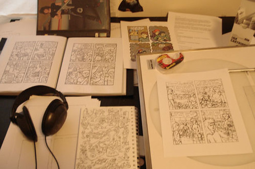
I don’t use a pencil at all. Instead I do my rough drafts with the same pen that I’ll do the final version with. I trace over my roughs with the use of a light box. I find that I could never match the consistency from pencil to paper and that erasing is a nightmare. So I quit using pencils long ago. With the use of a light table, I can do multiple drafts with my Pigma brush pens and Pigma Microns 05 and 08. I simply use cheap Xerox paper because I end up doing lots of drafts. This works for me because I limit myself to 4 panels a page. If I wanted a page with more panels, I’d use a larger format. Also, copy paper is thin, which makes it more transparent. And I don’t have to worry about messing up and wasting it! I like the size too because it fits neatly on the scanner. For color I use Photoshop and draw with a wacom tablet. In referencing CMYK, I use a Color Index book for reference.
Tool timeline, starting from when you began drawing in any serious way until the present, and what spurred the changes: The use of a light table changed the way I worked. I started doing multiple drafts and in the process, my art developed into a cleaner style. Now I’m starting to draw directly into the computer using a wacom tablet. Using layers, it’s a very similar process.
What tools you'd never use, and why: A mechanical pencil. And Pen Nibs. Because the pencil is too predictable and the nibs are too unpredictable.
Basic Bio: I’m a librarian who tends to draw comics about “troubled youth”.
Comics: A Last Cry For Help
Website: www.davekcomics.com
Making comics since year of: 1997
Art education/schools attended: One year of art school was helpful.
Tools
I don’t use a pencil at all. Instead I do my rough drafts with the same pen that I’ll do the final version with. I trace over my roughs with the use of a light box. I find that I could never match the consistency from pencil to paper and that erasing is a nightmare. So I quit using pencils long ago. With the use of a light table, I can do multiple drafts with my Pigma brush pens and Pigma Microns 05 and 08. I simply use cheap Xerox paper because I end up doing lots of drafts. This works for me because I limit myself to 4 panels a page. If I wanted a page with more panels, I’d use a larger format. Also, copy paper is thin, which makes it more transparent. And I don’t have to worry about messing up and wasting it! I like the size too because it fits neatly on the scanner. For color I use Photoshop and draw with a wacom tablet. In referencing CMYK, I use a Color Index book for reference.
Tool timeline, starting from when you began drawing in any serious way until the present, and what spurred the changes: The use of a light table changed the way I worked. I started doing multiple drafts and in the process, my art developed into a cleaner style. Now I’m starting to draw directly into the computer using a wacom tablet. Using layers, it’s a very similar process.
What tools you'd never use, and why: A mechanical pencil. And Pen Nibs. Because the pencil is too predictable and the nibs are too unpredictable.
May 22, 2007
Pat Lewis

Comics: THE CLAWS COME OUT (due Nov. 2007 from IDW), various minicomics including "Thankless Job," "Hideous," "Abominable," "One Horse Town"
Website: www.lunchbreakcomics.com
Making comics since year of: 2002 maybe? It's hard to pinpoint exactly when I quit screwing around and got serious about it.
Art education/schools attended: No formal art training, but writing is an important part of making comics, too: I have a BA in English from Penn State.
Tools
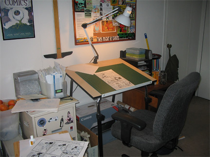
Pencils: I sometimes do my penciling in a coffee shop, away from my studio, so anything that needs to be sharpened isn't a good option for me. Right now, I use a Koh-i-noor mechanical drafting pencil with Pentel .05 blue leads. The blue drops out when you adjust the threshold in Photoshop which is good because you don't need to erase your pencils that way. The bad part is that you CAN'T erase them very well, which can be a pain if you need to redraw a panel multiple times.
Pens: Micron 05 (or equivalent), Faber-Castell PITT artist (brush) pen, Uni-ball Micro for tiny details.
Paper: Canson 14" x 17" vellum-surfaced bristol, cut in half to make two 8 1/2" x 14" sheets (I draw my pages at 8" x 12"). Lots of people swear by Strathmore, but I like the Canson--it's a brighter white and has just enough "tooth" for my tastes.
Lettering: No one ever talks about Ames guides! I space my lines of text with an Ames guide, but I'm never too sure what to set the wheel at, so I use the fixed set of holes on the left-hand side. I do the finished lettering with a Micron 05, and a Penstix 0.7 mm drafting marker for bold text.
Color: Photoshop! I recently upgraded to CS for an illustration job, but I got along fine with version 5.0 and before that, the limited version that came free with my scanner.
Layout/ Composition: Nothing fancy--I make tiny (approx. 1" x 2") thumbnails in my sketchbook, on scratch paper, or wherever's handy. I find I spend too much time and energy on my layouts, it kills my desire to work on the actual page.
Tool timeline, starting from when you began drawing in any serious way until the present, and what spurred the changes: I went through a series of cheap felt-tip pens until I fell in love with the Fountain Pentel sometime in the 90's. It gave a nice variety of thin and thick(ish) lines that you don't normally get from most felt-tips. Eventually, they changed it from a cheap, disposable pen to a more expensive refillable model, which was okay except the refill cartridges were tough to find. So I switched to Microns, which are pretty ubiquitous and can still provide a good line variety if you know what you're doing.
What tools you'd never use, and why: I never say never, but I don't really have any interest in dipping a pen or brush into India ink ever again. The potential mess and the fear that I'm going to make a huge mistake really holds me back and keeps me from working as fast and spontaneous as I like.
And lastly, any advice you'd like to give: I enjoy reading about artists' tools as much as the next dude, but don't let anyone make you feel guilty for how you work. The results are all that matters, and odds are any shortcomings you may have are probably the result of your skill level rather than what kind of pen you use (at least, that's the case with me). No matter how weird or unorthodox your methods, I guarantee there's a professional artist out there doing great work with an even crazier way of working.

Comics: THE CLAWS COME OUT (due Nov. 2007 from IDW), various minicomics including "Thankless Job," "Hideous," "Abominable," "One Horse Town"
Website: www.lunchbreakcomics.com
Making comics since year of: 2002 maybe? It's hard to pinpoint exactly when I quit screwing around and got serious about it.
Art education/schools attended: No formal art training, but writing is an important part of making comics, too: I have a BA in English from Penn State.
Tools
Pencils: I sometimes do my penciling in a coffee shop, away from my studio, so anything that needs to be sharpened isn't a good option for me. Right now, I use a Koh-i-noor mechanical drafting pencil with Pentel .05 blue leads. The blue drops out when you adjust the threshold in Photoshop which is good because you don't need to erase your pencils that way. The bad part is that you CAN'T erase them very well, which can be a pain if you need to redraw a panel multiple times.
Pens: Micron 05 (or equivalent), Faber-Castell PITT artist (brush) pen, Uni-ball Micro for tiny details.
Paper: Canson 14" x 17" vellum-surfaced bristol, cut in half to make two 8 1/2" x 14" sheets (I draw my pages at 8" x 12"). Lots of people swear by Strathmore, but I like the Canson--it's a brighter white and has just enough "tooth" for my tastes.
Lettering: No one ever talks about Ames guides! I space my lines of text with an Ames guide, but I'm never too sure what to set the wheel at, so I use the fixed set of holes on the left-hand side. I do the finished lettering with a Micron 05, and a Penstix 0.7 mm drafting marker for bold text.
Color: Photoshop! I recently upgraded to CS for an illustration job, but I got along fine with version 5.0 and before that, the limited version that came free with my scanner.
Layout/ Composition: Nothing fancy--I make tiny (approx. 1" x 2") thumbnails in my sketchbook, on scratch paper, or wherever's handy. I find I spend too much time and energy on my layouts, it kills my desire to work on the actual page.
Tool timeline, starting from when you began drawing in any serious way until the present, and what spurred the changes: I went through a series of cheap felt-tip pens until I fell in love with the Fountain Pentel sometime in the 90's. It gave a nice variety of thin and thick(ish) lines that you don't normally get from most felt-tips. Eventually, they changed it from a cheap, disposable pen to a more expensive refillable model, which was okay except the refill cartridges were tough to find. So I switched to Microns, which are pretty ubiquitous and can still provide a good line variety if you know what you're doing.
What tools you'd never use, and why: I never say never, but I don't really have any interest in dipping a pen or brush into India ink ever again. The potential mess and the fear that I'm going to make a huge mistake really holds me back and keeps me from working as fast and spontaneous as I like.
And lastly, any advice you'd like to give: I enjoy reading about artists' tools as much as the next dude, but don't let anyone make you feel guilty for how you work. The results are all that matters, and odds are any shortcomings you may have are probably the result of your skill level rather than what kind of pen you use (at least, that's the case with me). No matter how weird or unorthodox your methods, I guarantee there's a professional artist out there doing great work with an even crazier way of working.
Subscribe to:
Posts (Atom)